25 Inspiring Website Navigation Designs for UI/UX Designers

In the ever-evolving world of web design, website navigation examples play a crucial role in shaping user experience and determining the success of a site. As designers, we're constantly seeking inspiration and innovative approaches to create intuitive, visually appealing navigation systems. This comprehensive guide will explore 25 outstanding website navigation examples, delving into best practices and offering insights to help you elevate your design game.
Table of Contents
25 Best Website Navigation Examples
Now, let's explore 25 best website navigation designs that are setting the bar high in 2024:
Stripe
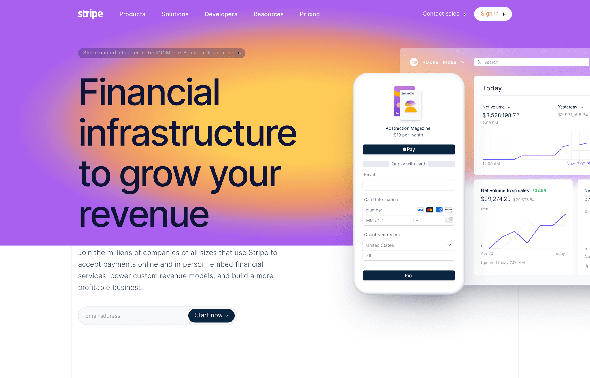
Stripe's website navigation example is a masterclass in simplicity and functionality. The clean, minimalist design features a sticky header with dropdown menus that expand to reveal well-organized subcategories. The use of subtle animations and clear typography makes navigation effortless.
Key features:
- Sticky header with logo and main navigation items
- Dropdown menus for Products, Solutions, and Developers
- Clear, concise labels
- High contrast between text and background
- Subtle hover effects for improved user feedback
Awwwards
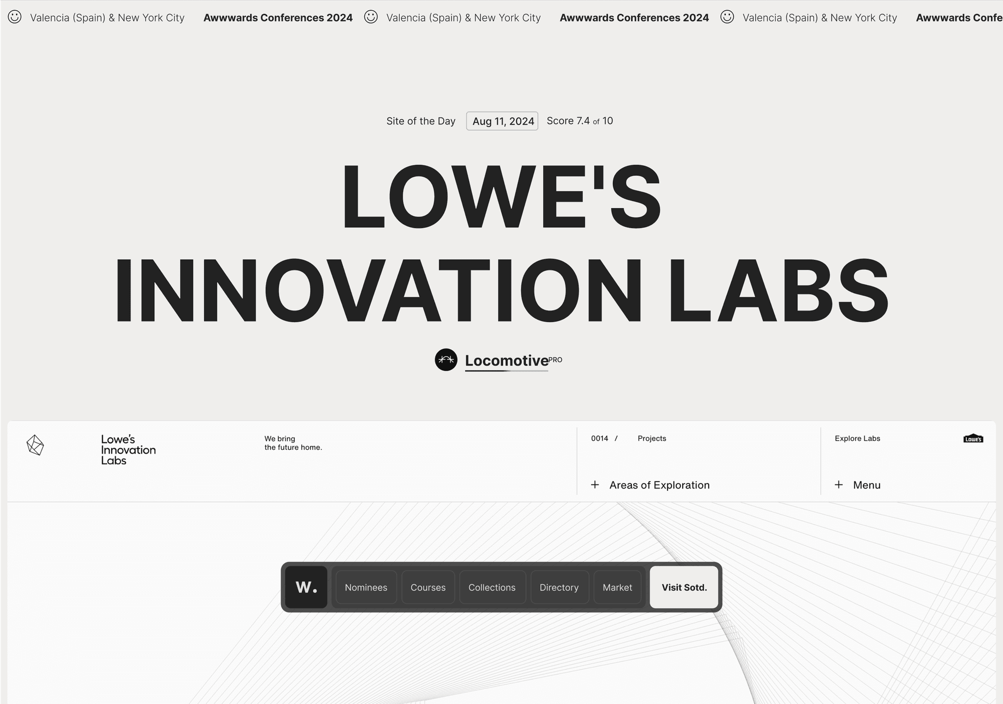
As a showcase for great web design, Awwwards' website navigation doesn't disappoint. The site features a unique horizontal scrolling navigation that's both visually striking and highly functional, allowing users to browse through categories with ease.
Key features:
- Horizontal scrolling navigation for main categories
- Sticky header with logo and essential links
- Search functionality prominently displayed
- Visual indicators for active categories
- Smooth animations for enhanced user experience
Mailchimp
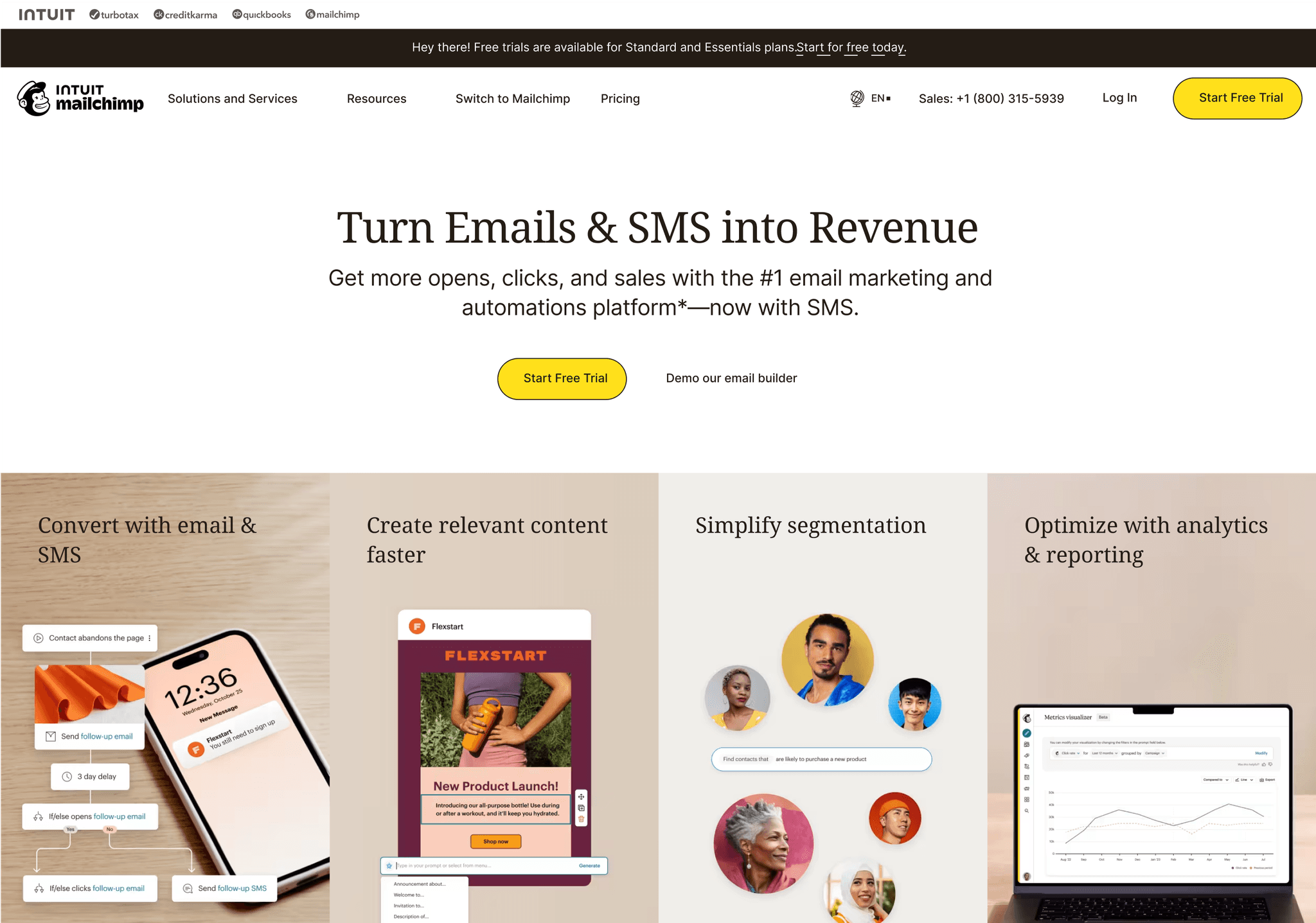
Mailchimp's navigation is a perfect example of how to balance simplicity with comprehensive functionality. The main menu items are clear and concise, while dropdown menus reveal a wealth of options without overwhelming the user.
Key features:
- Clean, minimalist header with logo and main navigation items
- Mega menus for Products, Resources, and Inspiration
- Clear categorization within dropdown menus
- Consistent use of icons to enhance visual appeal
- Mobile-responsive design with a hamburger menu for smaller screens
Airbnb
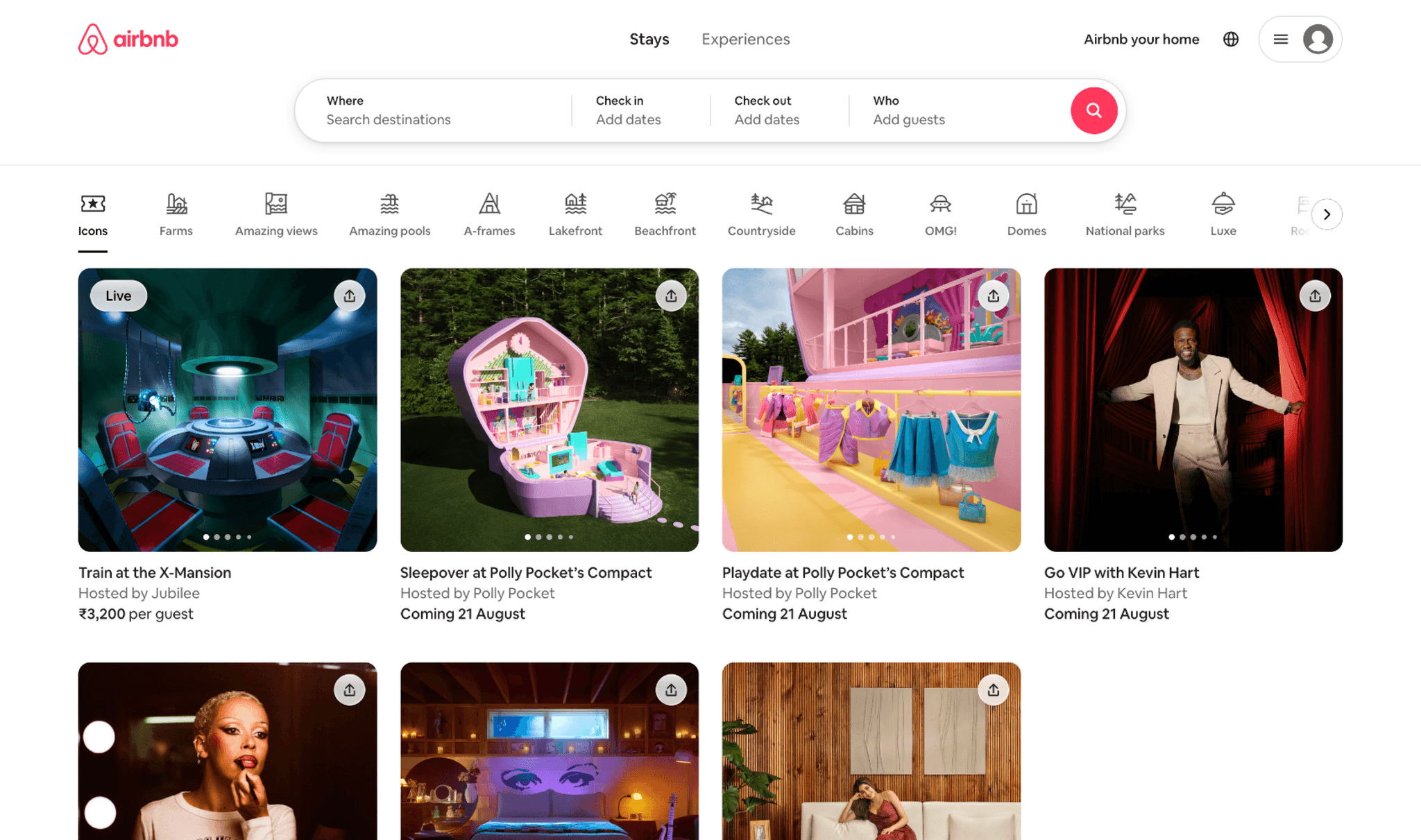
Airbnb's navigation is a testament to user-centric design. The search bar takes center stage, flanked by essential navigation items. The use of icons and clear typography makes the navigation intuitive and visually appealing.
Key features:
- Prominent search bar as the focal point of navigation
- Clean, minimalist header with essential links
- User account menu with dropdown options
- Subtle animations for enhanced interactivity
- Responsive design adapting seamlessly to different screen sizes
Dropbox
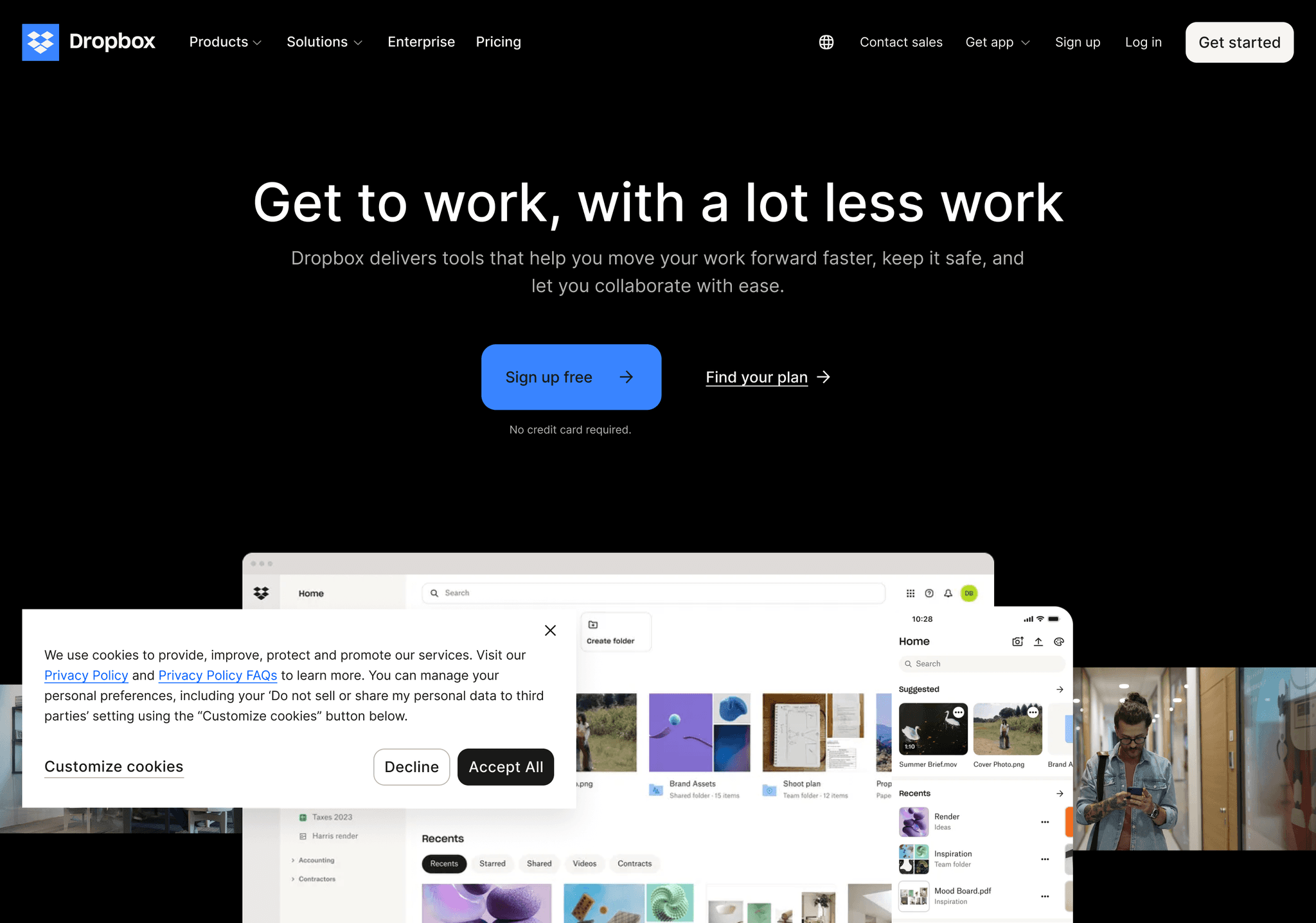
Dropbox's navigation is clean, simple, and highly effective. The use of a sticky header ensures that navigation options are always accessible, while dropdown menus provide quick access to key features and information.
Key features:
- Sticky header with logo and main navigation items
- Dropdown menus for Products, Solutions, and Pricing
- Clear call-to-action buttons for signing up or getting started
- Consistent use of blue accent color for improved visual hierarchy
- Smooth transitions and hover effects
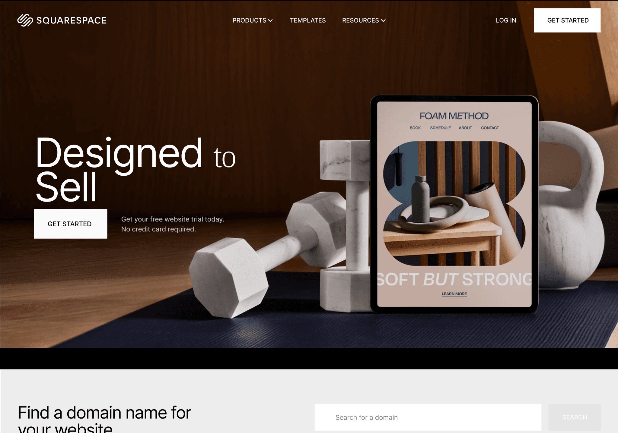
Squarespace
Airbnb's navigation is a testament to user-centric design. The search bar takes center stage, flanked by essential navigation items. The use of icons and clear typography makes the navigation intuitive and visually appealing.
Key features:
- Prominent search bar as the focal point of navigation
- Clean, minimalist header with essential links
- User account menu with dropdown options
- Subtle animations for enhanced interactivity
- Responsive design adapting seamlessly to different screen sizes
Notion
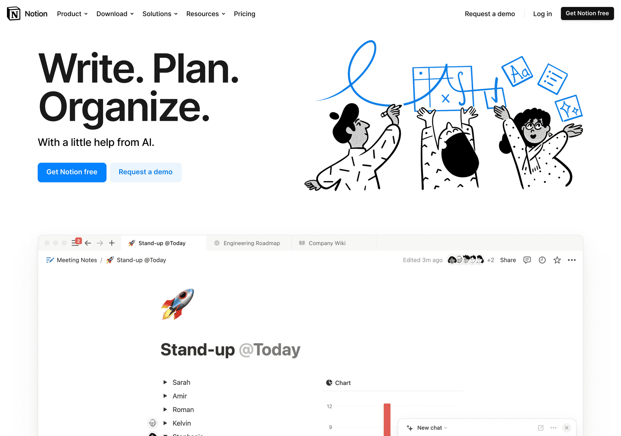
Notion's navigation is a great example of how to handle complex information architecture. The use of a sidebar navigation with collapsible sections allows users to quickly access different areas of the app while maintaining a clean interface.
Key features:
- Sidebar navigation with collapsible sections
- Clear icons paired with text labels for improved usability
- Search functionality prominently displayed
- Customizable workspace switcher
- Smooth animations for expanding and collapsing sections
Figma
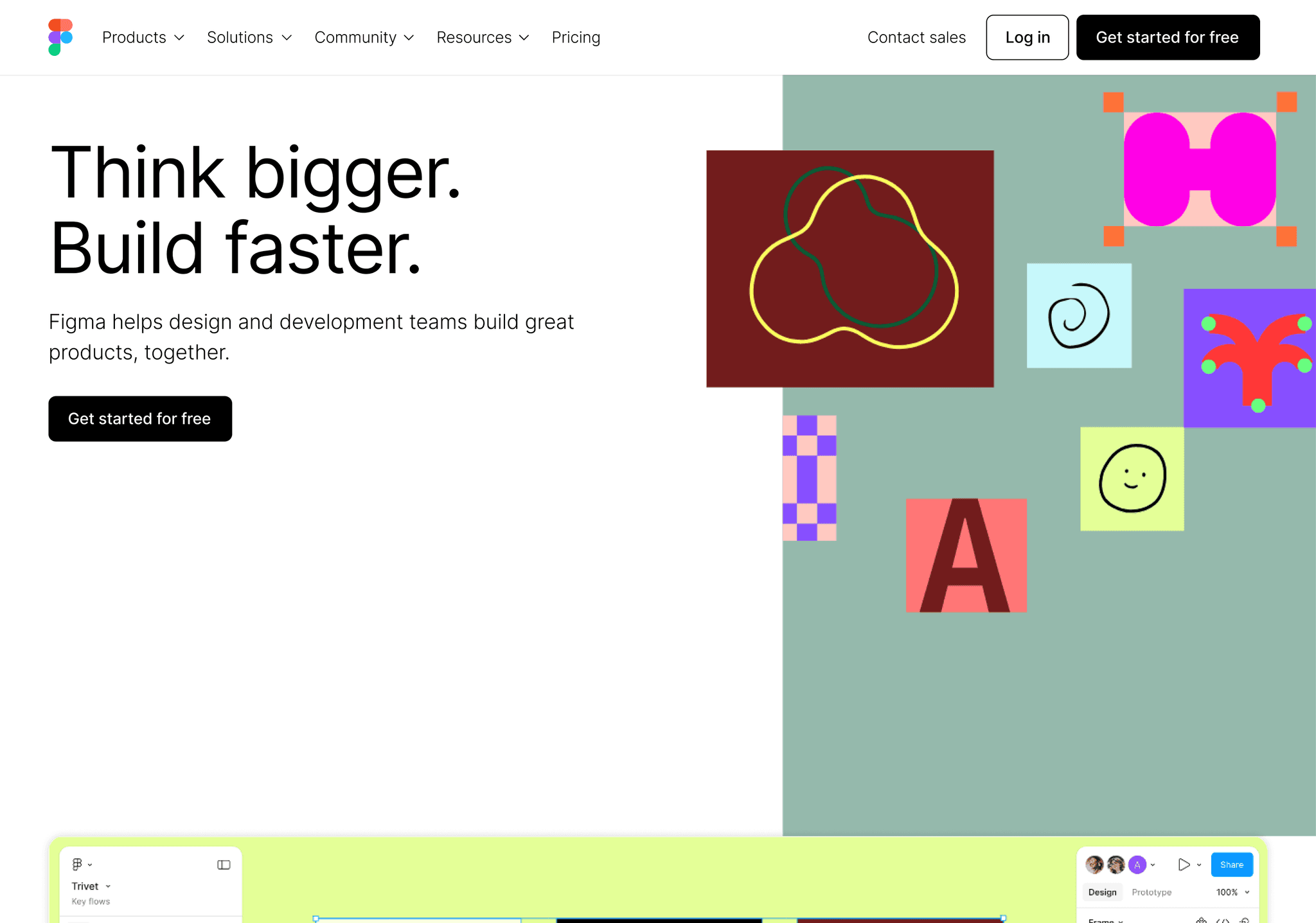
Figma's navigation is sleek and intuitive, featuring a top bar with dropdown menus and a sidebar for more detailed navigation within specific sections. The design seamlessly adapts to different screen sizes, ensuring a consistent experience across devices.
Key features:
- Clean top bar with logo and main navigation items
- Dropdown menus for Products, Enterprise, and Community
- Sidebar navigation for in-app functionality
- Clear call-to-action buttons for signing up or getting started
- Consistent use of purple accent color for improved visual hierarchy
Webflow
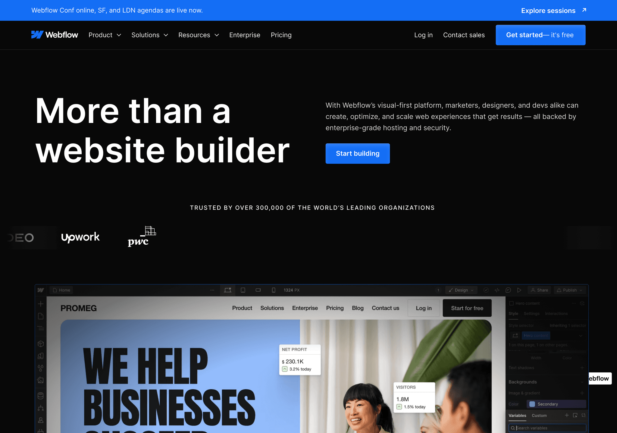
Webflow's navigation is a fantastic example of how to organize a large amount of content without overwhelming users. The use of mega menus and clear categorization makes it easy for users to find what they're looking for.
Key features:
- Clean header with logo and main navigation items
- Mega menus for Product, Resources, and Company
- Visual content within mega menus to enhance engagement
- Clear categorization and hierarchy within dropdown menus
- Responsive design adapting seamlessly to different screen sizes
Pitch

Pitch's navigation is simple yet effective, featuring a clean header with dropdown menus. The use of subtle animations and clear typography enhances the user experience.
Key features:
- Minimalist header with logo and main navigation items
- Dropdown menus for Product, Resources, and Company
- High contrast between text and background for improved readability
- Subtle hover effects and transitions
- Mobile-responsive design with a hamburger menu for smaller screens
Framer
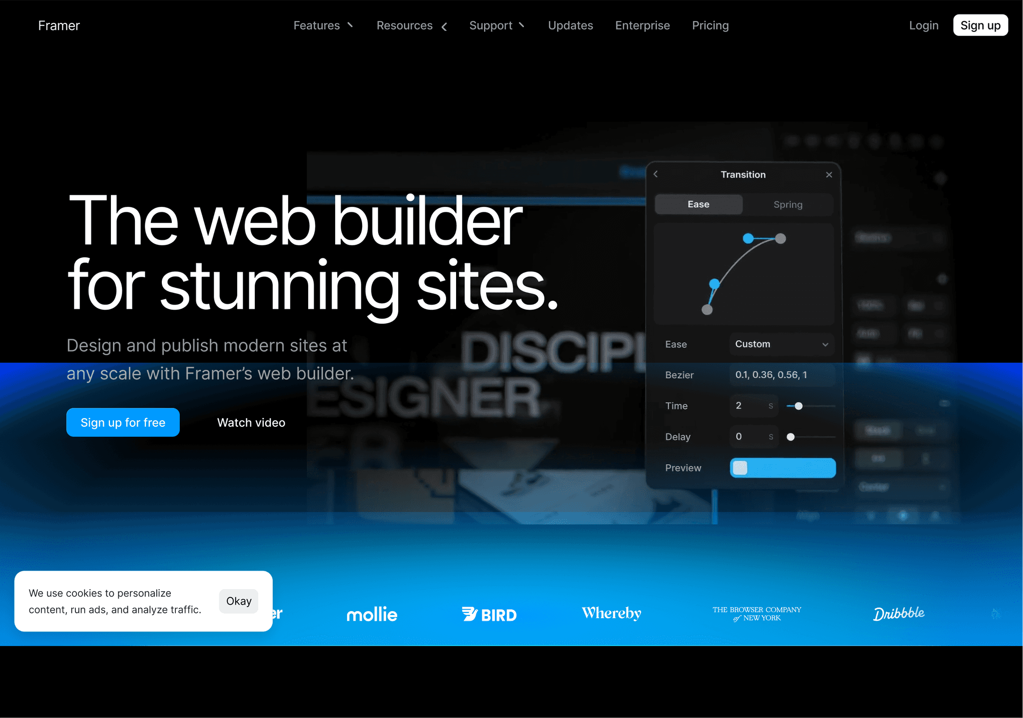
Framer's navigation is a great example of how to combine simplicity with depth. The main menu items are concise, while dropdown menus reveal more detailed options. The use of icons and clear typography enhances usability.
Key features:
- Clean header with logo and main navigation items
- Dropdown menus for Features, Resources, and Enterprise
- Consistent use of icons to enhance visual appeal
- Clear call-to-action buttons for signing up or getting started
- Smooth animations for improved user feedback
Maze
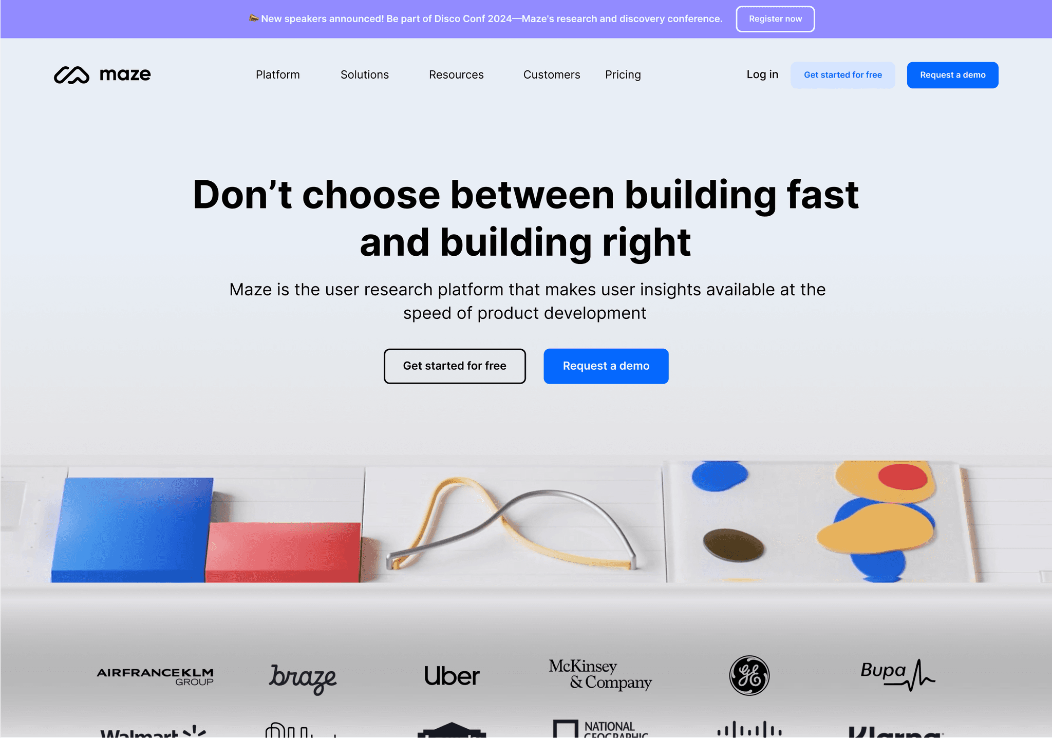
Maze's navigation is clean and user-friendly, featuring a sticky header with dropdown menus. The use of subtle hover effects and clear categorization makes it easy for users to explore the site's content.
Key features:
- Sticky header with logo and main navigation items
- Dropdown menus for Product, Solutions, and Learn
- High contrast between text and background
- Subtle hover effects and transitions
- Responsive design adapting seamlessly to different screen sizes
Abstract

Abstract's navigation is a masterclass in minimalism. The clean, simple design features clear labels and subtle animations, making it easy for users to find what they need without distraction.
Key features:
- Minimalist header with logo and main navigation items
- Dropdown menus for Product and Resources
- Clear, concise labels
- Subtle hover effects for improved user feedback
- Mobile-responsive design with a hamburger menu for smaller screens
Invision
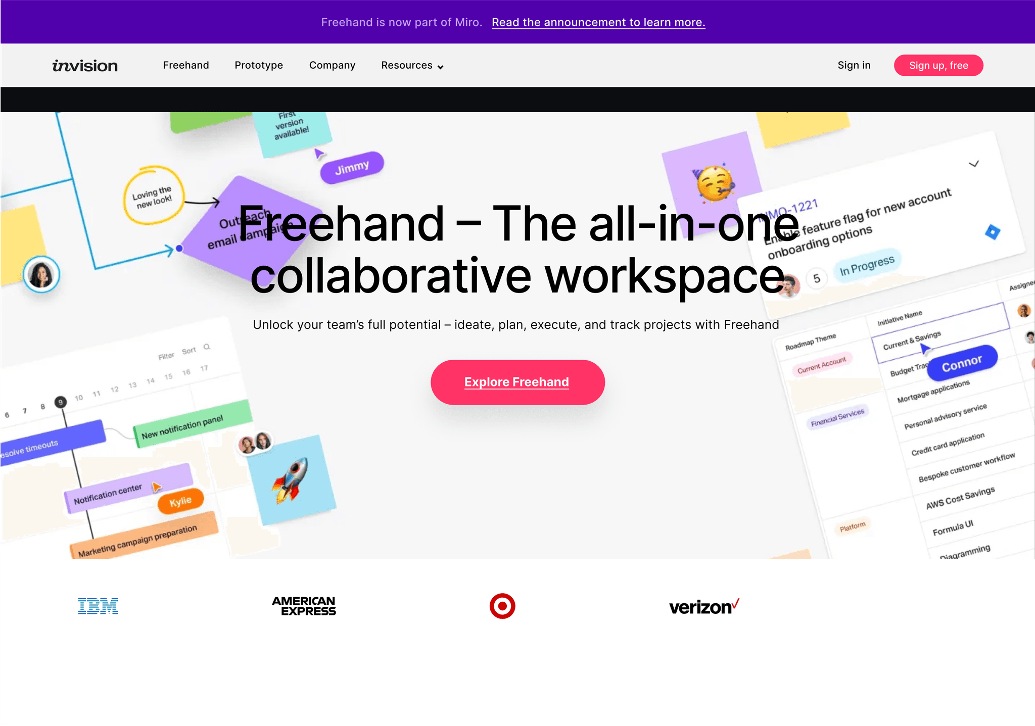
Invision's navigation is both stylish and functional. The use of a sticky header with dropdown menus ensures that navigation options are always accessible, while the clean design complements the site's overall aesthetic.
Key features:
- Sticky header with logo and main navigation items
- Dropdown menus for Product, Learn, and Company
- Clear call-to-action buttons for signing up or getting started
- Consistent use of purple accent color for improved visual hierarchy
- Smooth transitions and hover effects
Loom
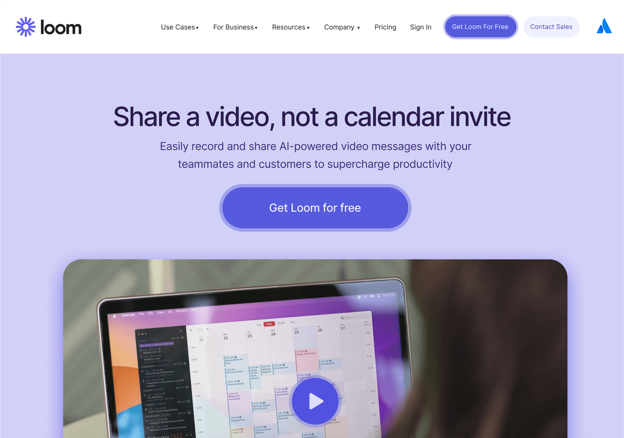
Loom's navigation is simple yet effective, featuring a clean header with dropdown menus. The use of icons and clear typography enhances usability, while the design adapts seamlessly to different screen sizes.
Key features:
- Clean header with logo and main navigation items
- Dropdown menus for Product, Solutions, and Resources
- Consistent use of icons to enhance visual appeal
- Clear call-to-action buttons for signing up or getting started
- Responsive design with a hamburger menu for mobile devices
Miro
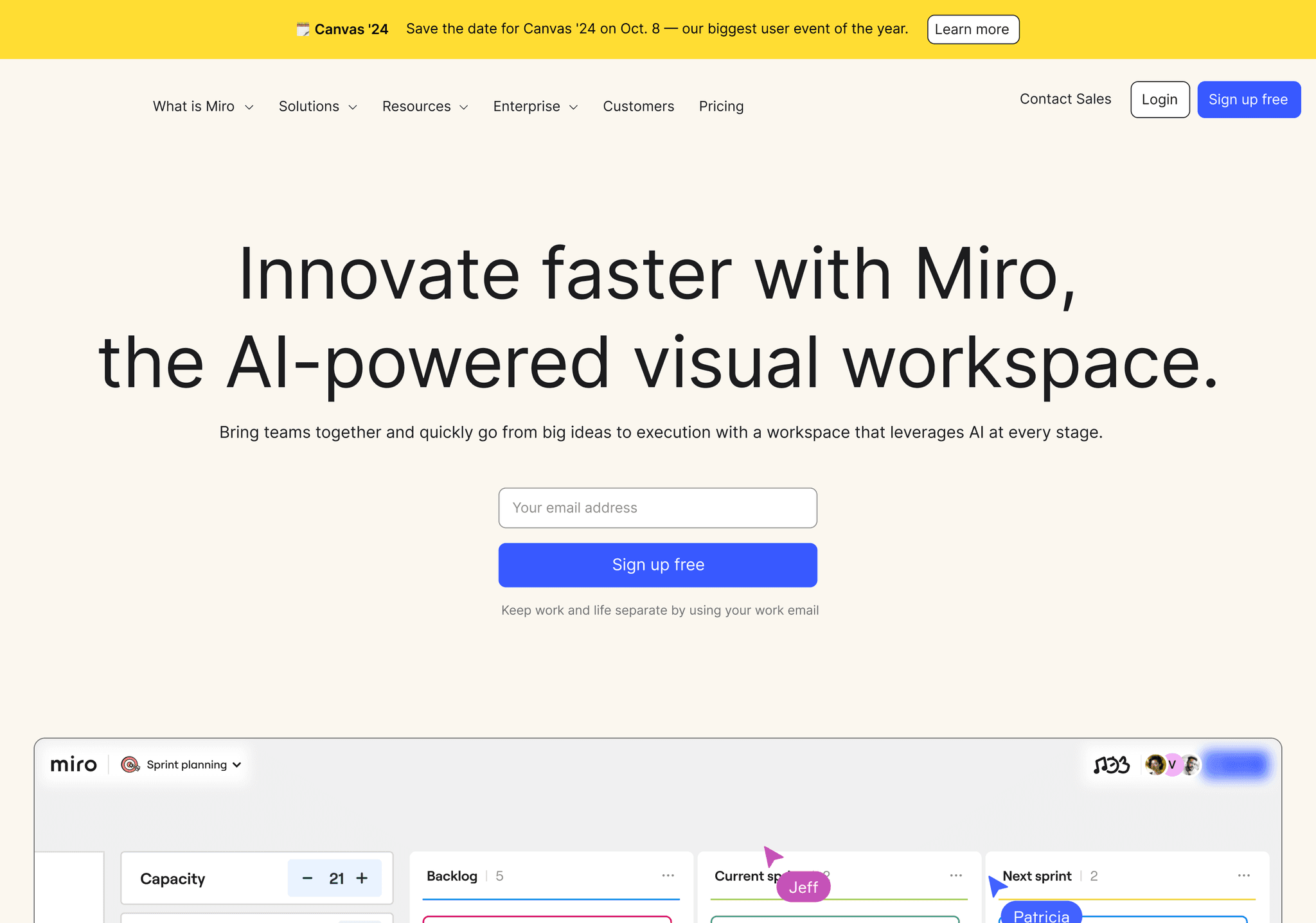
Miro's navigation is a great example of how to handle complex information architecture. The use of a top bar navigation with dropdown menus and a sidebar for more detailed navigation within the app provides users with multiple ways to access content.
Key features:
- Clean top bar with logo and main navigation items
- Dropdown menus for Product, Solutions, and Resources
- Sidebar navigation for in-app functionality
- Clear call-to-action buttons for signing up or getting started
- Consistent use of blue accent color for improved visual hierarchy
Airtable
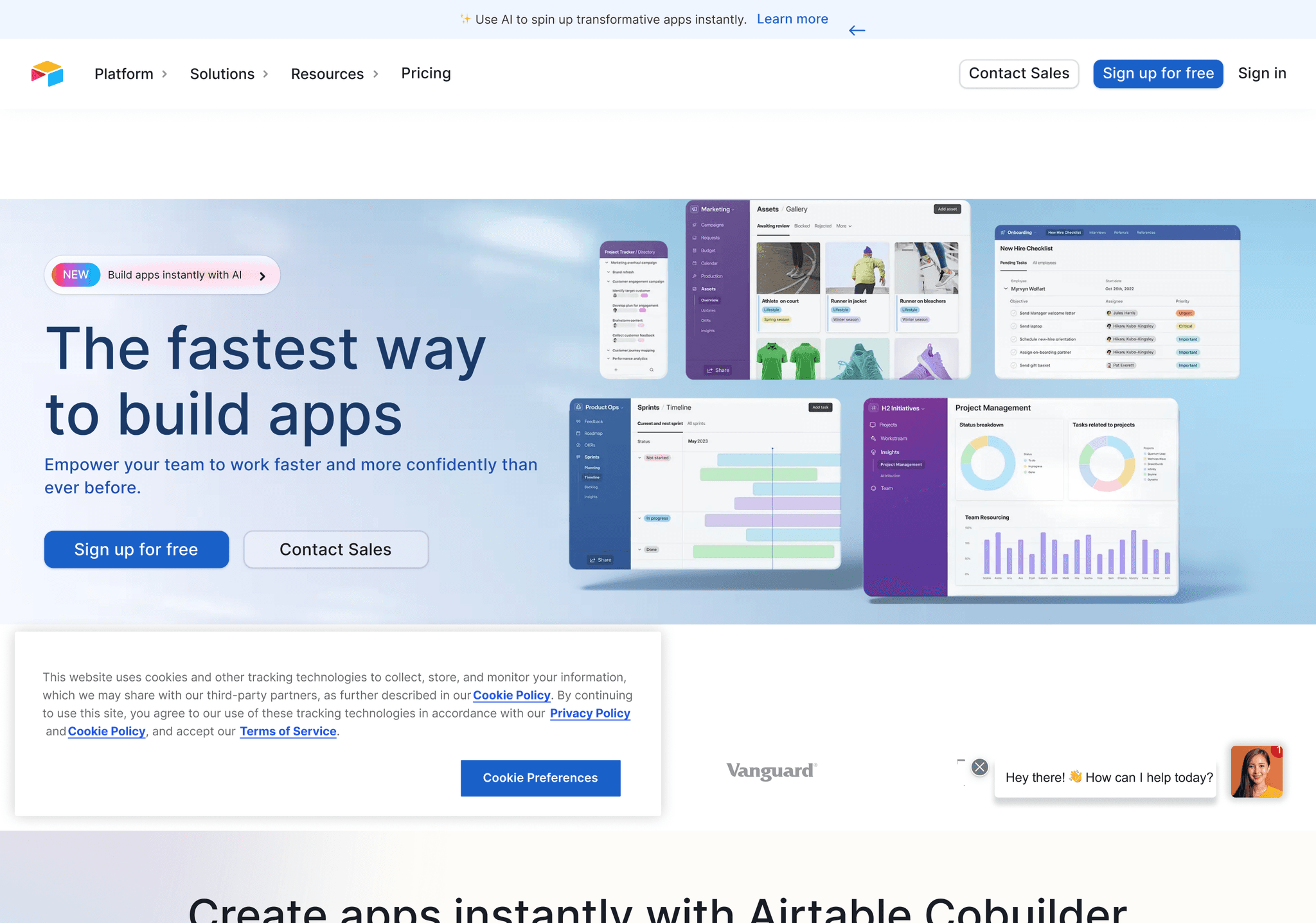
Airtable's navigation is clean and intuitive, featuring a top bar with dropdown menus. The use of clear labels and subtle hover effects enhances usability, while the design adapts well to mobile devices.
Key features:
- Minimalist header with logo and main navigation items
- Dropdown menus for Product, Solutions, and Resources
- High contrast between text and background for improved readability
- Subtle hover effects and transitions
- Mobile-responsive design with a hamburger menu for smaller screens
Canva
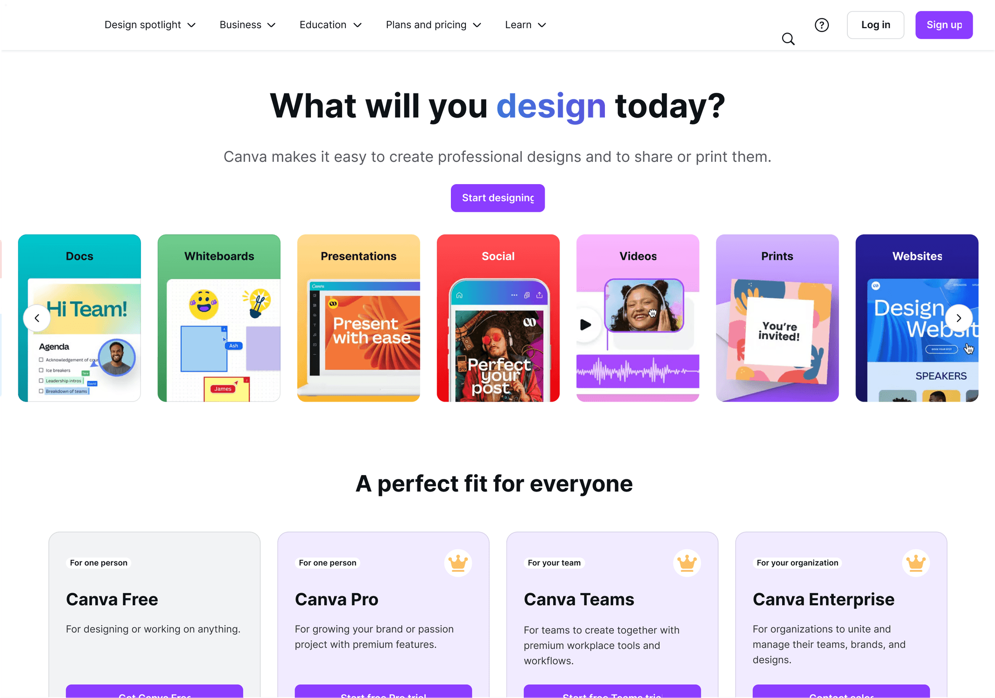
Canva's navigation is a perfect blend of simplicity and functionality. The main menu items are clear and concise, while dropdown menus reveal a wealth of options without overwhelming the user. The use of icons and clear typography enhances usability.
Key features:
- Clean header with logo and main navigation items
- Dropdown menus for Templates, Features, and Learn
- Consistent use of icons to enhance visual appeal
- Clear call-to-action buttons for signing up or getting started
- Responsive design adapting seamlessly to different screen sizes
Atomic
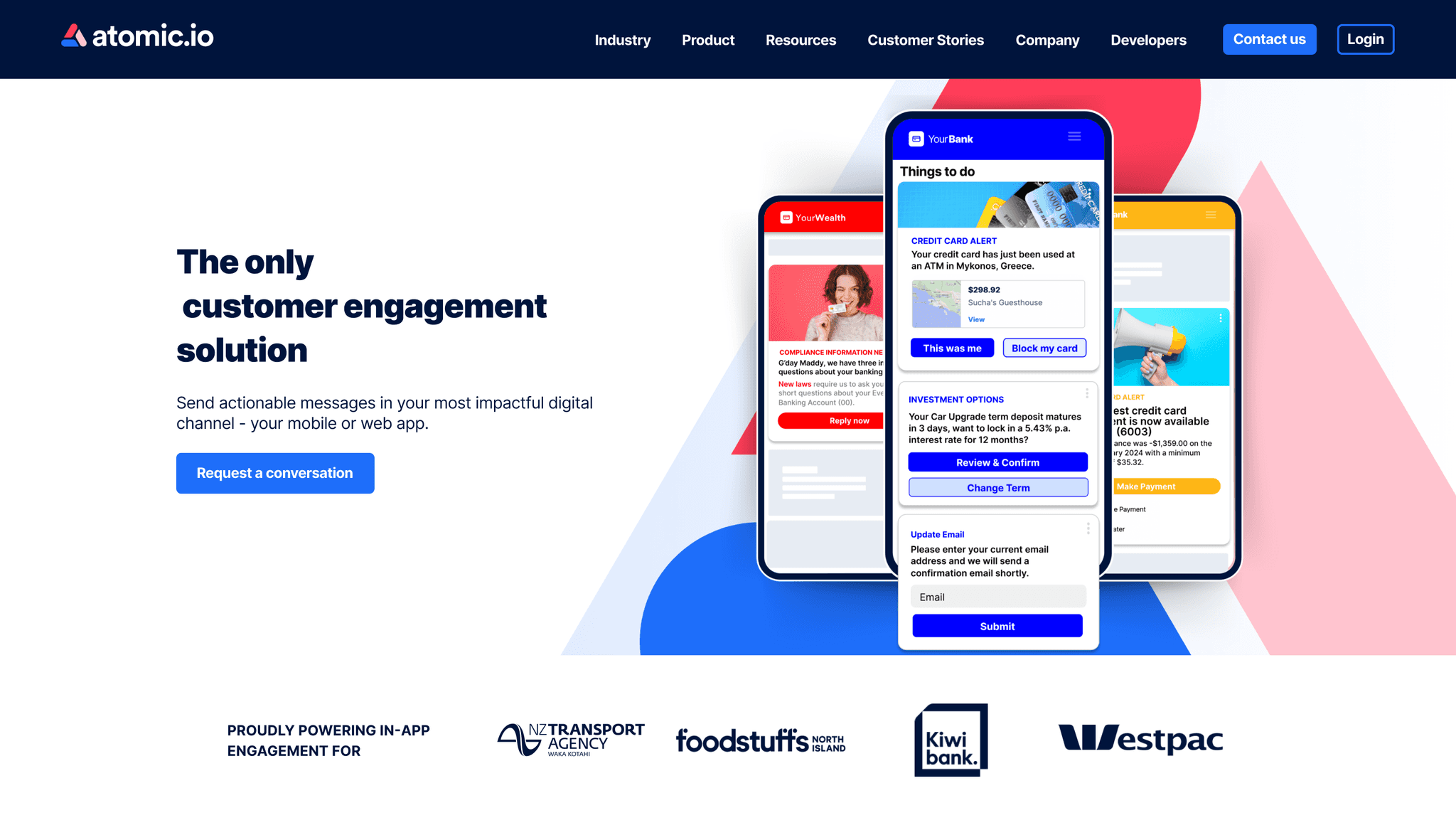
Atomic's navigation is sleek and minimalist, featuring a clean header with dropdown menus. The use of subtle animations and clear typography enhances the user experience, while the design adapts seamlessly to different screen sizes.
Key features:
- Minimalist header with logo and main navigation items
- Dropdown menus for Product, Solutions, and Resources
- High contrast between text and background
- Subtle hover effects and transitions
- Mobile-responsive design with a hamburger menu for smaller screens
Sketch
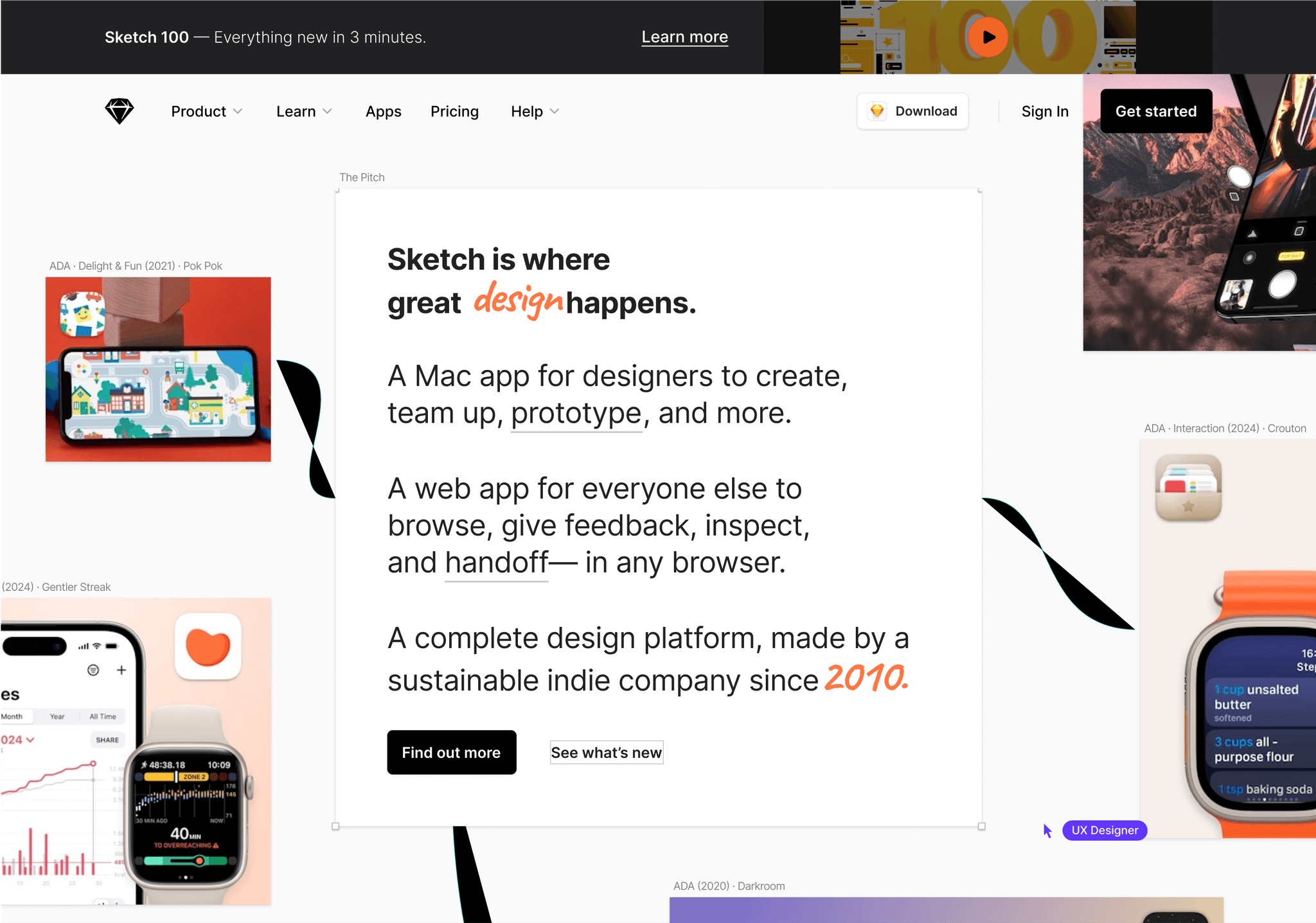
Sketch's navigation is both stylish and functional. The use of a sticky header with dropdown menus ensures that navigation options are always accessible, while the clean design complements the site's overall aesthetic.
Key features:
- Sticky header with logo and main navigation items
- Dropdown menus for Product, Learn, and Pricing
- Clear call-to-action buttons for downloading or trying the app
- Consistent use of blue accent color for improved visual hierarchy
- Smooth transitions and hover effects
Principle
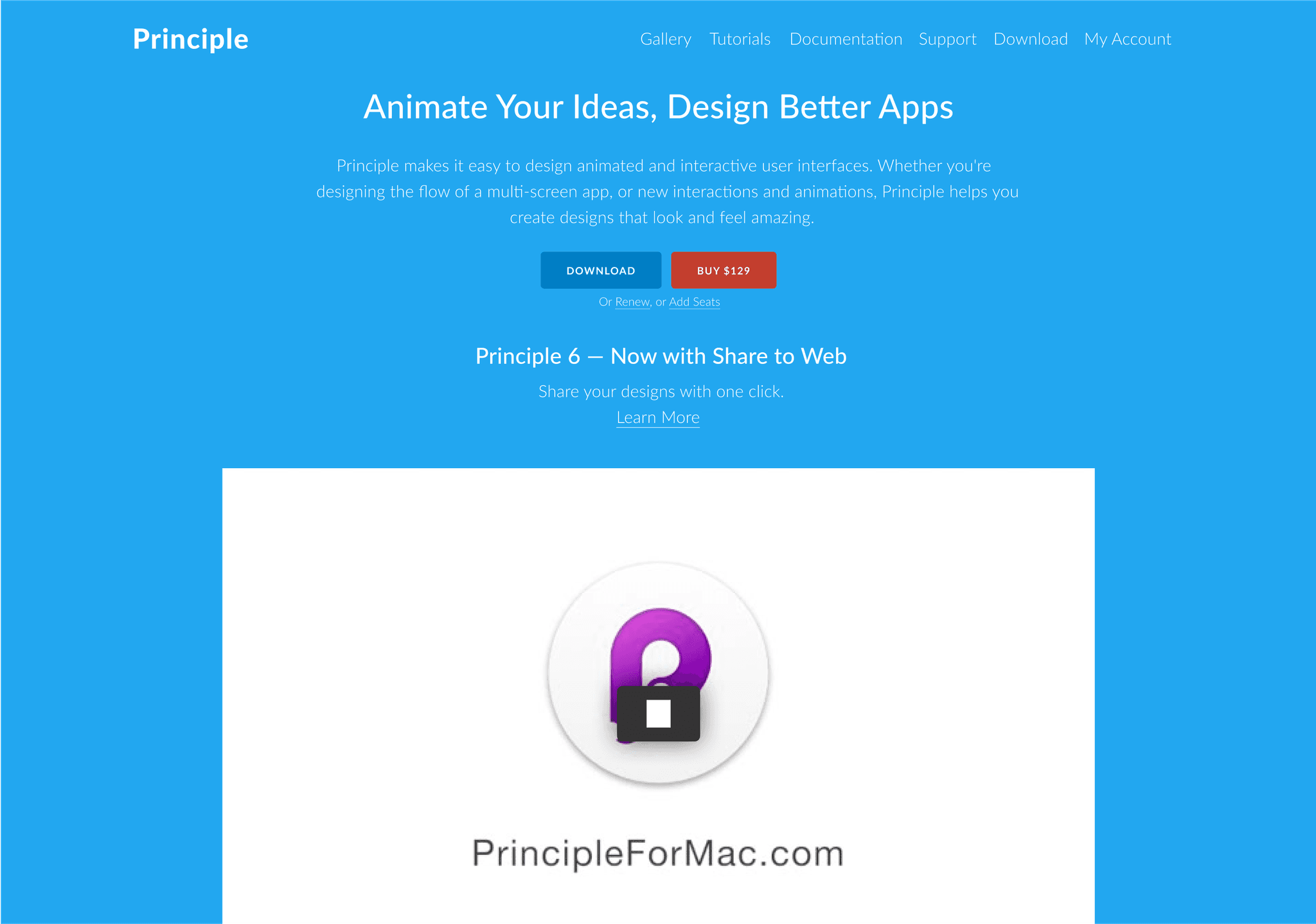
Principle's navigation is a great example of simplicity in action. The minimalist design features clear, concise labels and subtle hover effects, making it easy for users to find what they need.
Key features:
- Ultra-minimalist header with logo and essential navigation items
- Clear, concise labels for each navigation item
- High contrast between text and background
- Subtle hover effects for improved user feedback
- Responsive design that maintains simplicity across devices
Protopie
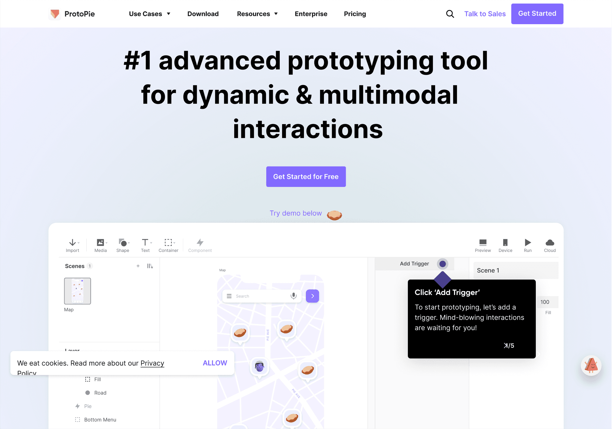
Protopie's navigation is clean and user-friendly, featuring a sticky header with dropdown menus. The use of clear categorization and subtle animations enhances the user experience.
Key features:
- Sticky header with logo and main navigation items
- Dropdown menus for Product, Learn, and Company
- Clear call-to-action buttons for trying the product
- Consistent use of orange accent color for improved visual hierarchy
- Smooth transitions and hover effects
Tailwind CSS
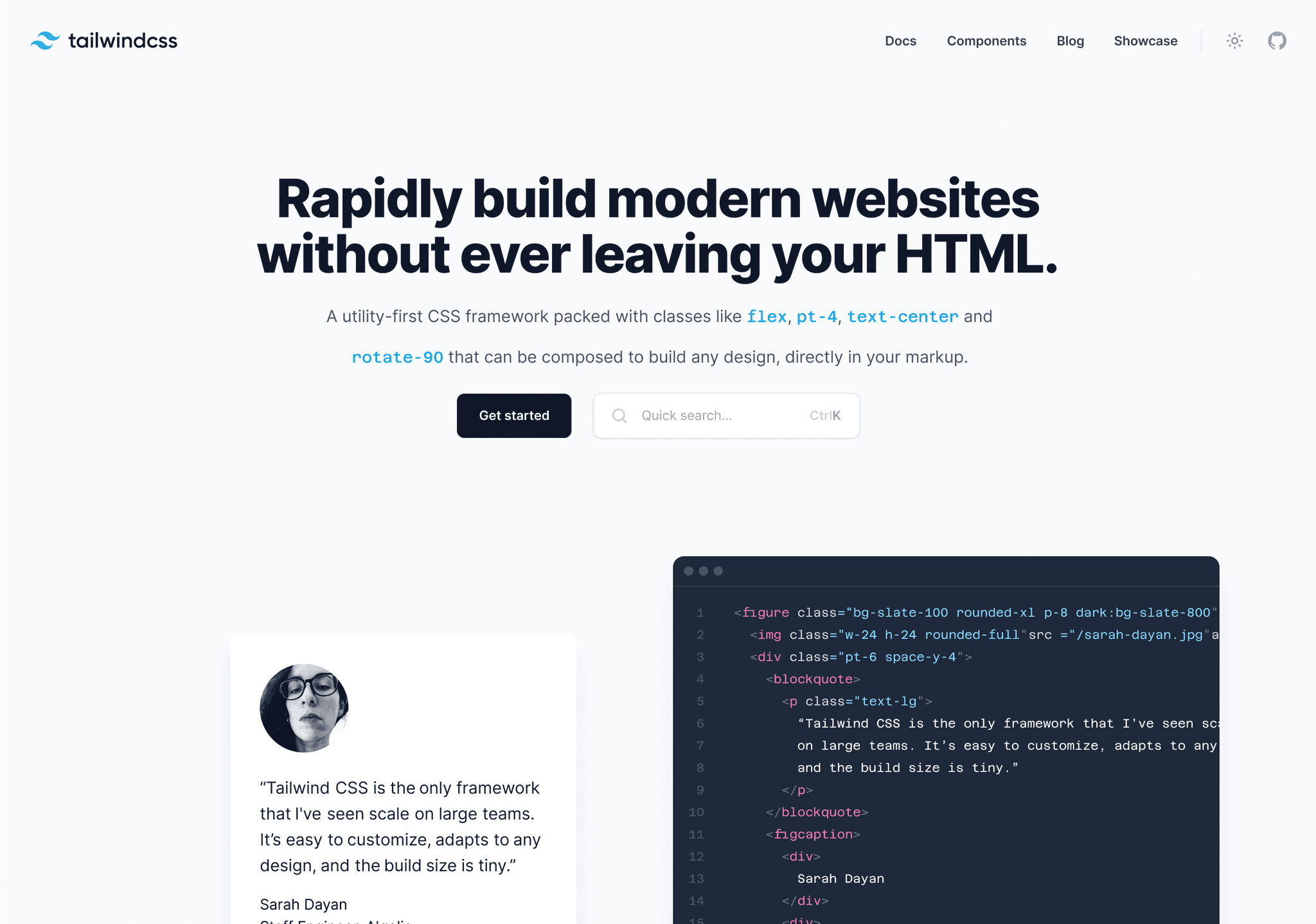
This navigation showcases how a utility-first CSS framework can create a sleek and functional interface. Designers can appreciate the balance between providing comprehensive documentation and maintaining a clean, uncluttered navigation.
Key features:
- Sticky header with logo and main navigation categories
- Sidebar navigation for detailed documentation sections
- Prominent search bar for quick access to specific information
- Dark mode toggle for improved user experience
- Version selector for accessing different releases of the framework
- Mobile-responsive design with collapsible sidebar for smaller screens
Buy Me A Coffee
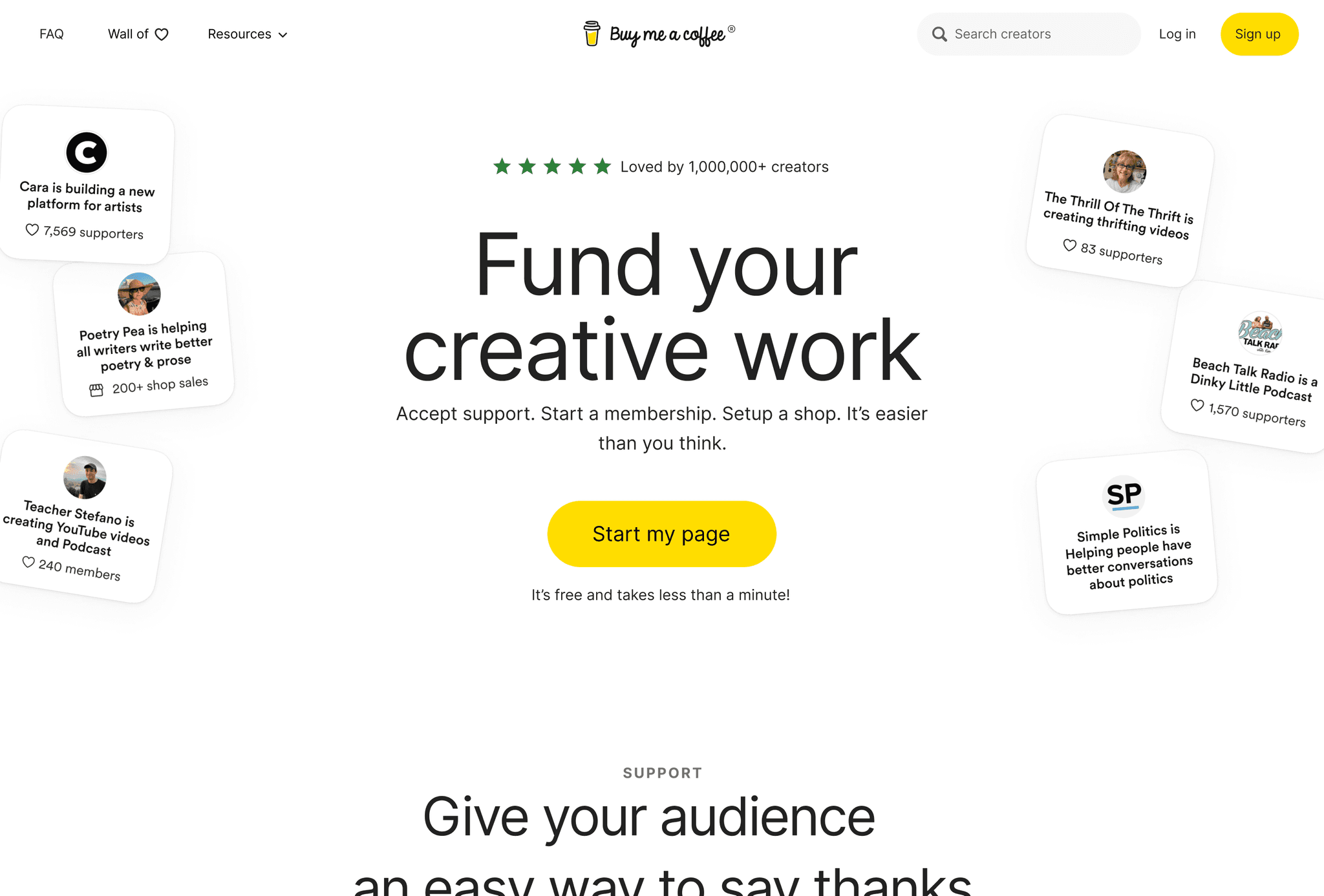
This navigation exemplifies simplicity and user-friendliness, catering to both creators and supporters. Designers can learn from its straightforward approach, which makes it easy for users to understand the platform's purpose and take action.
Key features:
- Clean, minimalist header with logo and essential navigation items
- Prominent call-to-action buttons for signing up and supporting creators
- Dropdown menu for user account and dashboard
- Playful coffee cup icon integrated into the design
- Mobile-responsive design with a simplified menu for smaller screens
Zeplin
Zeplin's navigation is clean and intuitive, featuring a top bar with dropdown menus. The use of clear labels and subtle hover effects enhances usability, while the design adapts well to mobile devices.
Key features:
- Minimalist header with logo and main navigation items
- Dropdown menus for Product, Solutions, and Resources
- High contrast between text and background for improved readability
- Subtle hover effects and transitions
- Mobile-responsive design with a hamburger menu for smaller screens
These 25 website navigation examples showcase a range of approaches to creating intuitive, visually appealing navigation systems. By studying these designs and using tools like the Web to Figma plugin, you can quickly adapt and implement similar navigation styles in your own projects. This powerful plugin allows you to convert any website navigation you find inspiring into an editable Figma file component within seconds. It's an invaluable resource for quickly adapting and implementing great website navigation designs
Website Navigation Best Practices
Based on the website navigation examples we've explored, let's summarize some key best practices for creating effective navigation:
- Keep it simple: Use clear, concise labels and avoid overwhelming users with too many options. As seen in examples like Stripe and Principle, simplicity can lead to a more focused user experience.
- Prioritize user needs: Organize your navigation based on what your users are looking for most frequently. Airbnb's prominent search bar is a great example of this principle in action.
- Maintain consistency: Use a consistent navigation style across all pages of your website. This helps users build a mental model of your site structure and navigate more efficiently, as demonstrated by sites like Mailchimp and Dropbox.
- Implement responsive design: Ensure your navigation works well on all devices, from desktop to mobile. Many of the examples we've seen, such as Squarespace and Figma, adapt their navigation seamlessly for different screen sizes.
- Use visual cues: Incorporate hover effects, active states, and other visual indicators to guide users. Subtle animations and transitions, as seen in examples like Awwwards and Framer, can significantly enhance the user experience.
- Provide multiple paths: Offer users different ways to access content, such as through header navigation, footer links, and search functionality. Miro and Adobe XD demonstrate how combining top bar and sidebar navigation can create a more comprehensive system.
- Use dropdown menus wisely: Implement dropdown or mega menus for subcategories when necessary, but avoid nesting too deeply. Webflow's mega menus are a great example of how to organize a large amount of content without overwhelming users.
- Incorporate search: Include a search function to help users quickly find specific content. This is especially important for content-rich sites, as demonstrated by Notion's prominent search bar.
- Consider sticky navigation: Use sticky headers to keep navigation options accessible as users scroll, as seen in examples like Stripe and Protopie.
- Test and iterate: Regularly conduct user testing and analyze user behavior to refine your navigation design. While we can't see this process directly in our examples, it's clear that sites like Airbnb and Canva have refined their navigation based on user feedback and behaviour.
By following these best practices and drawing inspiration from the website navigation examples we've explored, you can create navigation systems that are both visually appealing and highly functional.
Conclusion
Effective website navigation is crucial for creating a positive user experience and ensuring the success of your website. By studying these 25 website navigation examples and implementing the best practices we've discussed, you can create intuitive, visually appealing navigation systems that guide users seamlessly through your site.
Remember, great navigation design is an iterative process. Don't be afraid to experiment with different approaches and continuously refine your designs based on user feedback and behavior. Each of the examples we've explored, from the simplicity of Stripe to the comprehensive system of Adobe XD, has likely gone through numerous iterations to reach its current state.
To streamline your design process and quickly implement inspiring navigation designs, consider using tools like the Web to Figma plugin. This powerful tool allows you to convert any website navigation you find inspiring into an editable Figma file component within seconds, saving you time and helping you iterate on your designs more efficiently.
As you work on your own navigation designs, keep in mind the key principles we've discussed:
- Prioritize simplicity and clarity
- Focus on user needs and behavior
- Maintain consistency across your site
- Ensure responsiveness across devices
- Use visual cues to enhance usability
- Provide multiple paths to content
- Use dropdown menus effectively
- Incorporate search functionality
- Consider sticky navigation for improved accessibility
- Continuously test and refine your designs
By staying up-to-date with the latest trends in website navigation examples and continuously refining your approach, you can create navigation systems that not only look great but also provide an exceptional user experience. Remember, effective navigation is the foundation of a successful website, guiding users to the content they need and helping them accomplish their goals with ease.
As you implement these strategies and draw inspiration from the examples we've explored, you'll be well-equipped to create navigation designs that stand out in the competitive digital landscape. Whether you're working on a personal project, a client website, or a large-scale application, the principles and examples we've discussed will help you craft navigation systems that are both beautiful and highly functional.