30 Landing Page Design Inspirations of 2024

In the dynamic world of web design, landing pages serve as the digital front door to your brand, product, or service. They're often the first impression a visitor has of your offering, making their design crucial for capturing attention and driving conversions. As we navigate through 2024, landing page design continues to evolve, blending cutting-edge aesthetics with user-centric functionality.
Whether you're a seasoned designer, a UI/UX enthusiast, or a business owner looking to enhance your online presence, staying updated with the latest trends and inspirations is key to creating impactful digital experiences. This comprehensive guide will take you on a journey through 30 outstanding landing page examples that are setting new standards in 2024.
But we're not just here to admire from afar. We'll introduce you to a game-changing tool that's transforming the way designers work with web inspirations: the Web To Figma plugin. This innovative tool allows you to convert any website landing page into a fully editable Figma file within seconds, bridging the gap between inspiration and implementation.
So, buckle up as we explore these remarkable designs, uncover the trends shaping the future of landing pages, and discover how you can bring these inspirations to life in your own projects.
Table of Contents
30 Inspiring Landing Page Designs
Now, let's explore these 30 remarkable landing pages that are setting the bar high in 2024:
Basehub
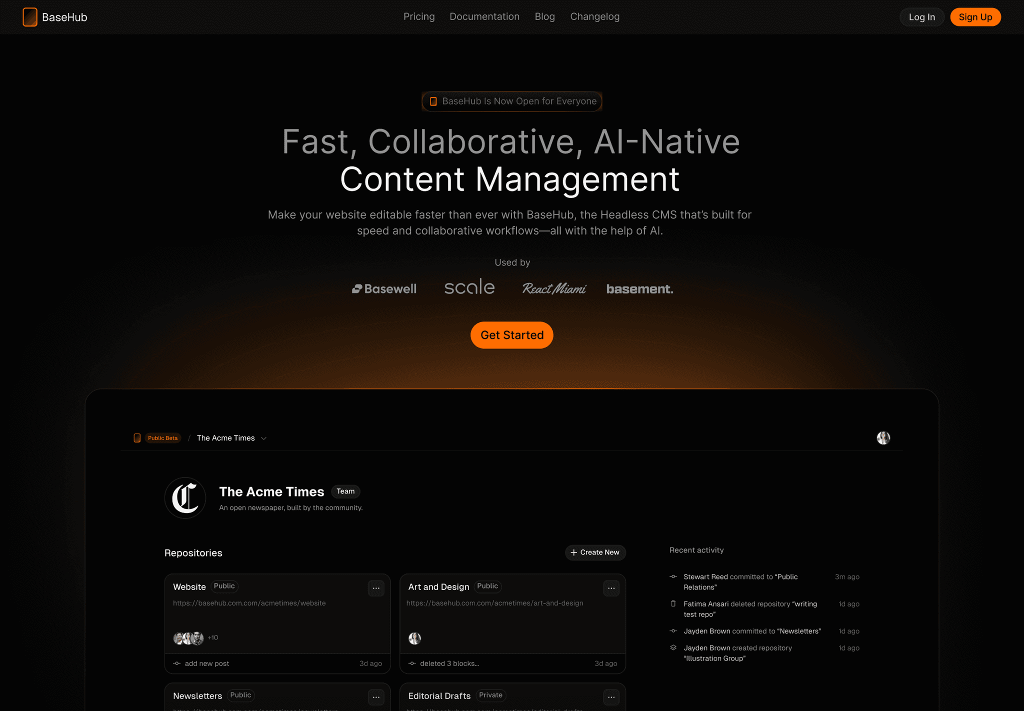
Simplicity Meets Functionality Basehub's landing page exemplifies the power of minimalism. With a clean, monochromatic design, it guides users' attention to key features without overwhelming them.
The strategic use of whitespace and bold typography creates a sense of clarity and professionalism.
Key takeaways:
- Monochromatic color scheme for a clean look
- Strategic use of whitespace to guide attention
- Bold typography for emphasis
MMM
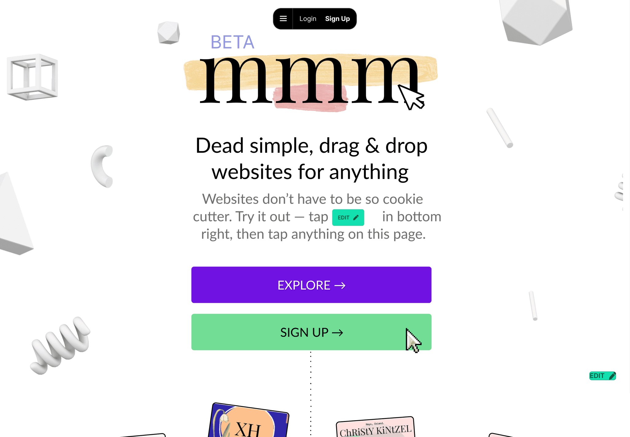
Vibrant and Playful MMM takes a different approach with its vibrant color palette and playful illustrations. This landing page proves that B2B doesn't have to be boring. The energetic design elements are balanced with clear, concise messaging that effectively communicates the brand's value proposition.
Key takeaways:
- Vibrant color palette to stand out
- Playful illustrations to add personality
- Clear messaging alongside visual elements
Plasmic
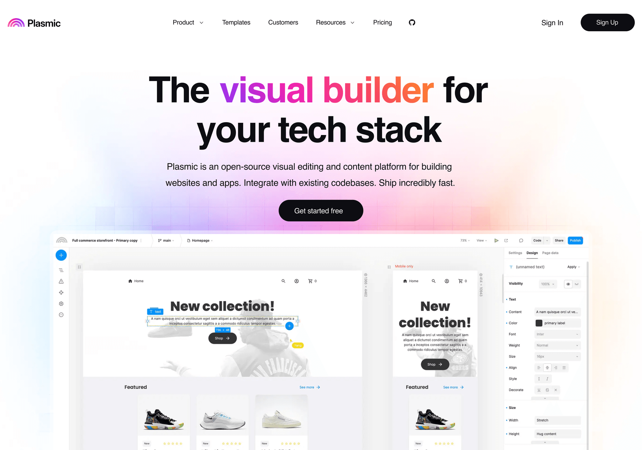
Dynamic and Forward-Thinking Plasmic's landing page stands out with its futuristic design elements and dynamic animations. The use of gradient overlays and geometric shapes creates a sense of depth and movement, reflecting the innovative nature of their product.
Key takeaways:
- Futuristic design elements
- Dynamic animations to engage users
- Gradient overlays for depth and visual interest
Raycast
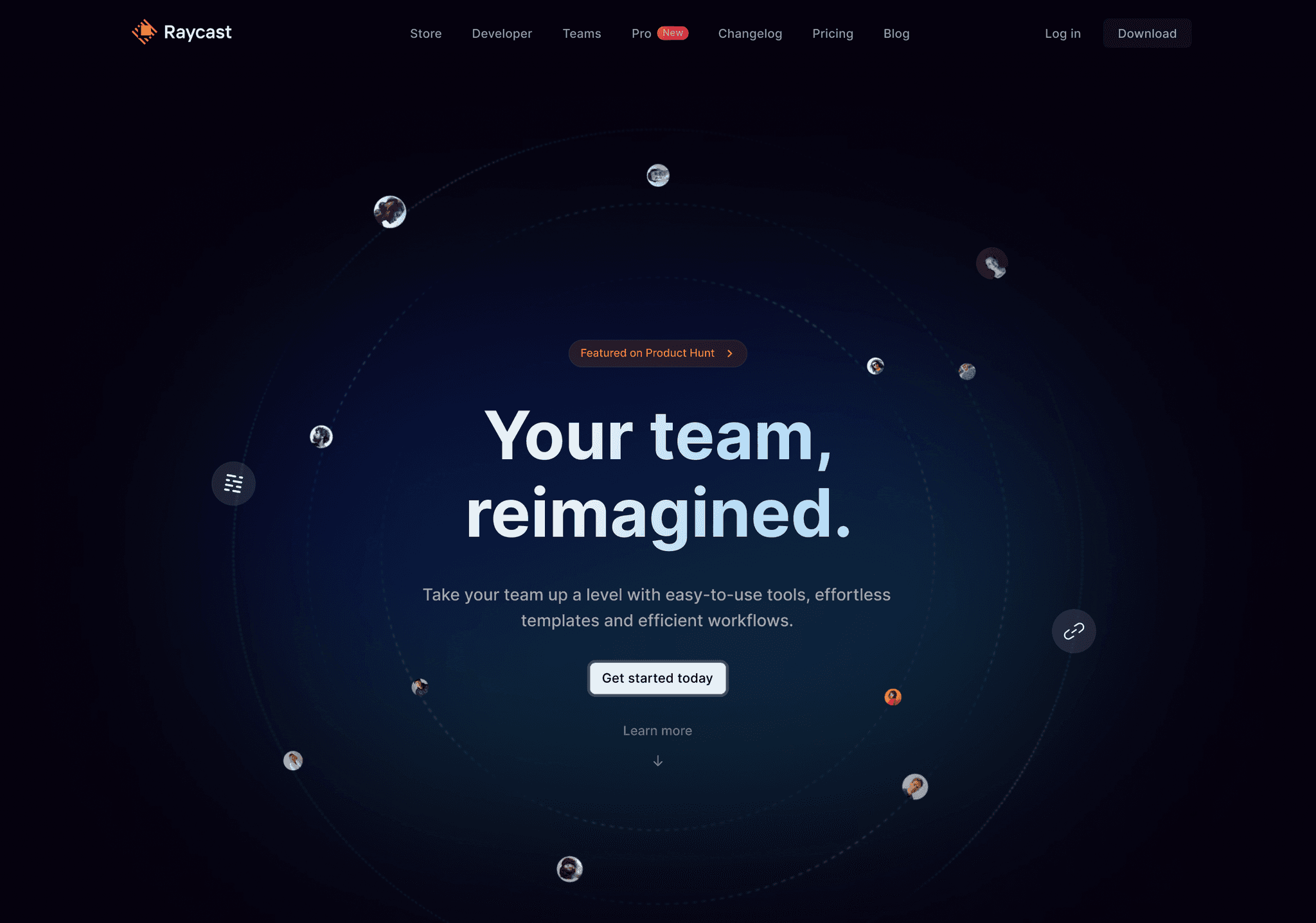
Sleek and Efficient Raycast's landing page is a masterclass in efficient design. The dark mode interface with pops of color draws attention to key features. The use of product screenshots and animations effectively demonstrates the tool's capabilities.
Key takeaways:
- Dark mode interface for a sleek look
- Strategic use of color to highlight features
- Effective use of product screenshots and animations
Vercel
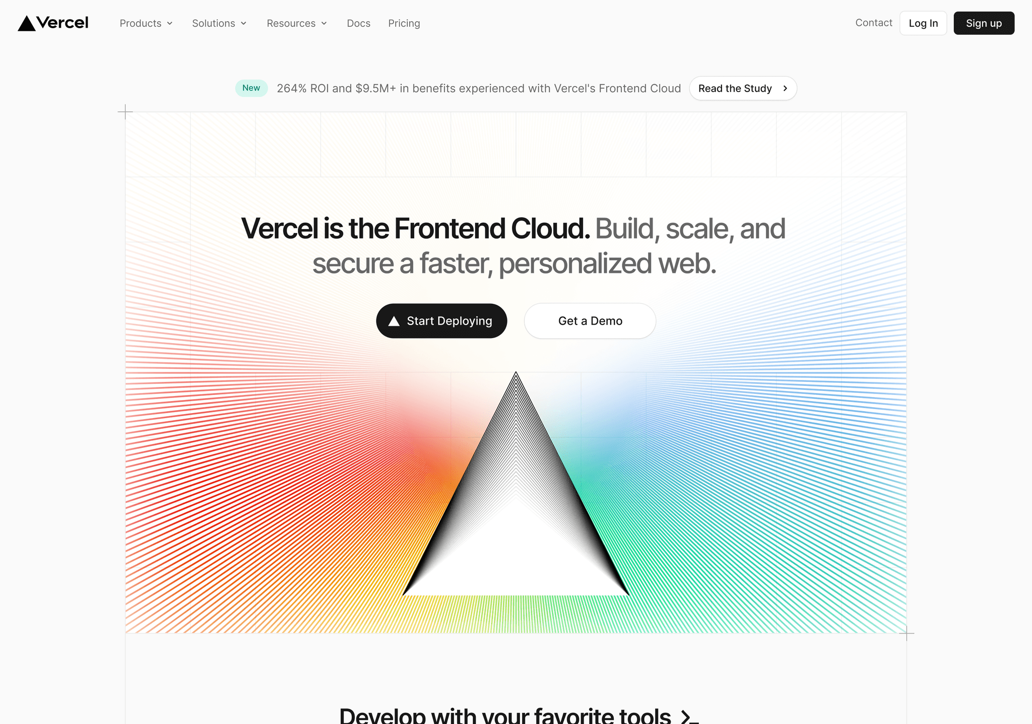
Bold and Developer-Focused Vercel's landing page speaks directly to its developer audience with a bold, code-inspired design. The dark background with vibrant accents creates a visually striking first impression while maintaining readability
Key takeaways:
- Code-inspired design elements
- High contrast color scheme
- Clear focus on developer audience
Notion
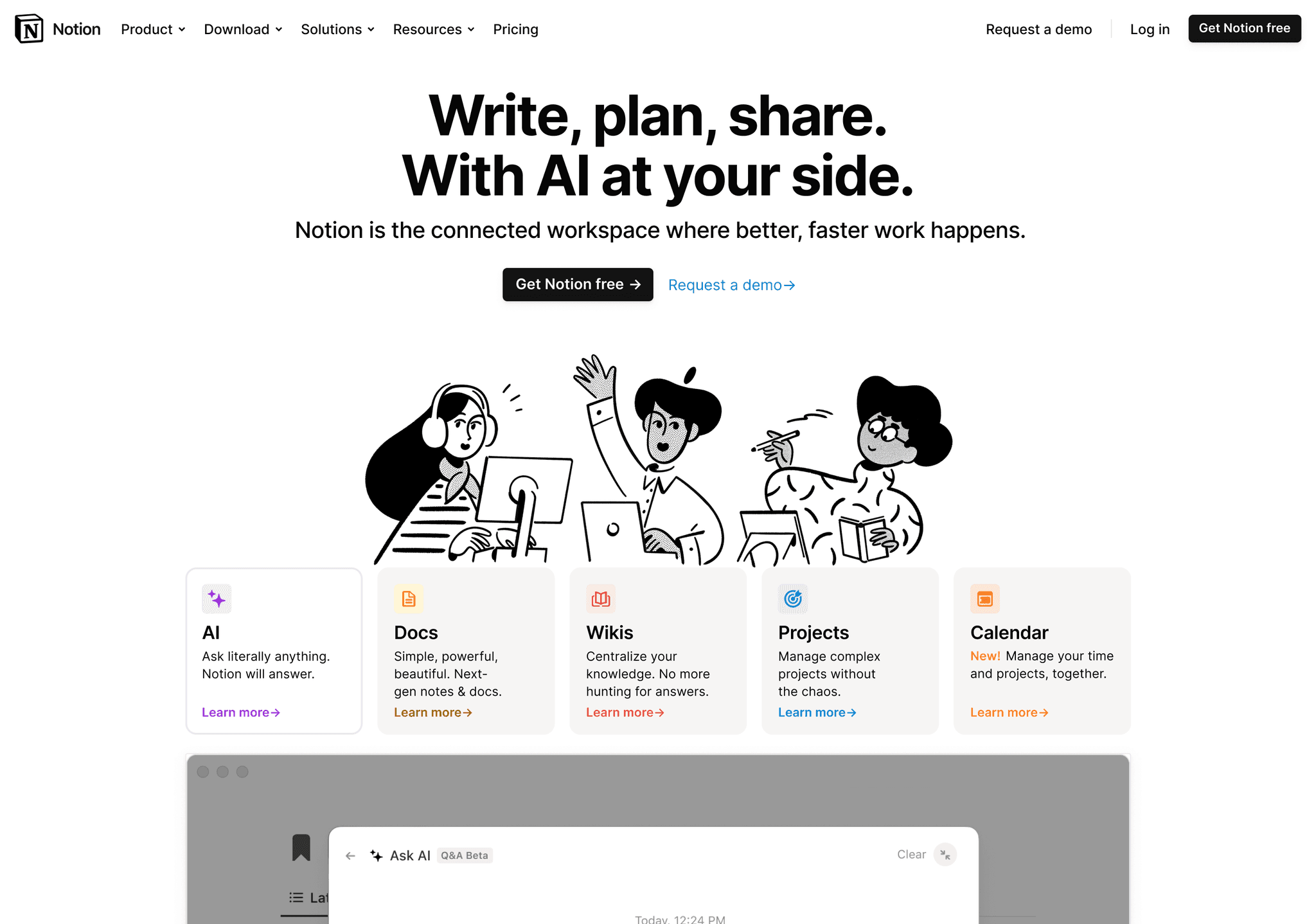
Clean and Intuitive Notion's landing page excels in its intuitive layout and clean design. The use of subtle animations and interactive elements guides users through the product's features seamlessly.
Key takeaways:
- Clean, uncluttered layout
- Subtle animations for user guidance
- Intuitive presentation of features
Resend
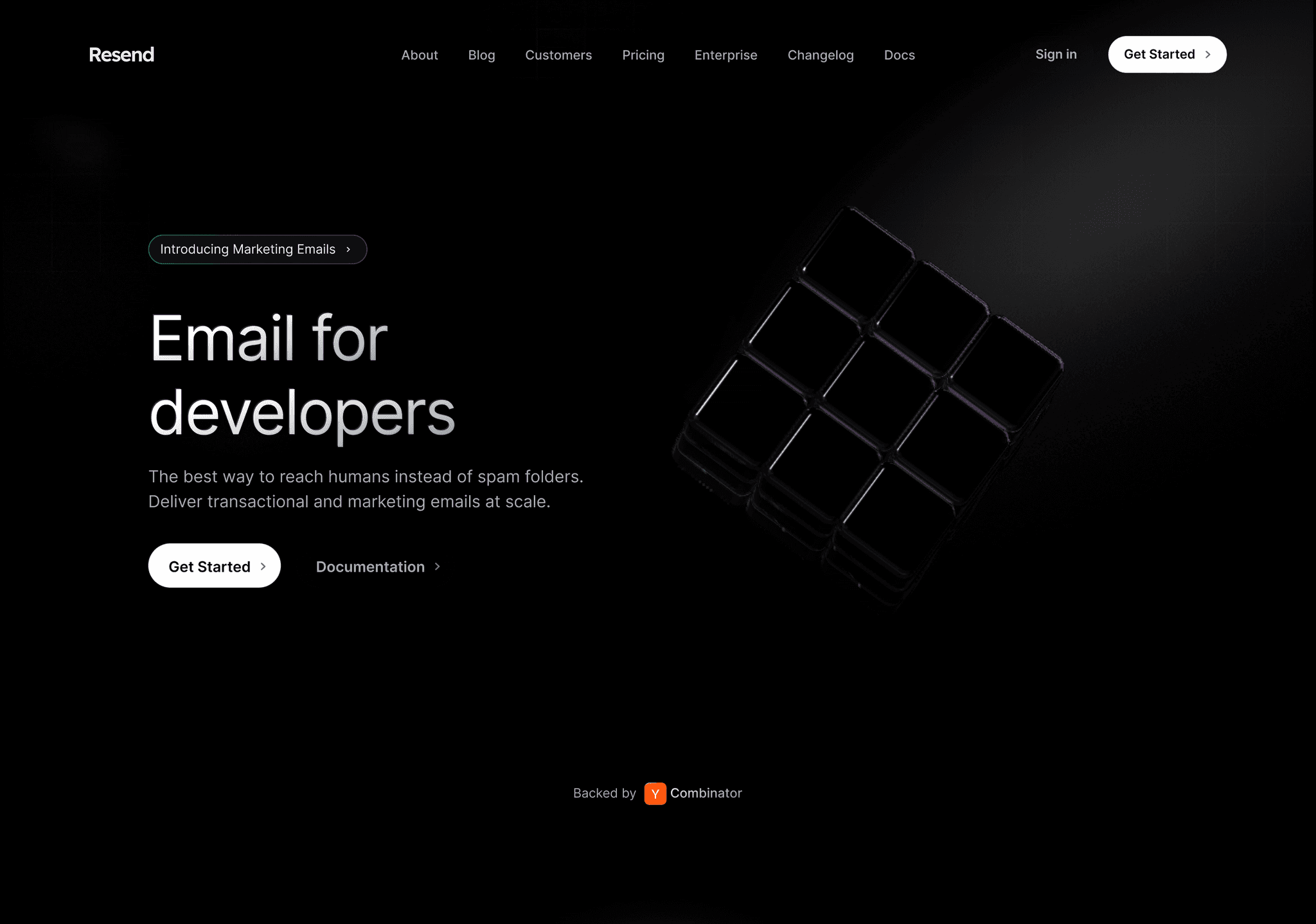
Minimalist with a Twist Resend takes minimalism to the next level with its unique typographic treatment. The creative use of negative space and bold lettering creates a memorable and distinctive look.
Key takeaways:
- Unique typographic design
- Creative use of negative space
- Distinctive and memorable aesthetic
Qonto
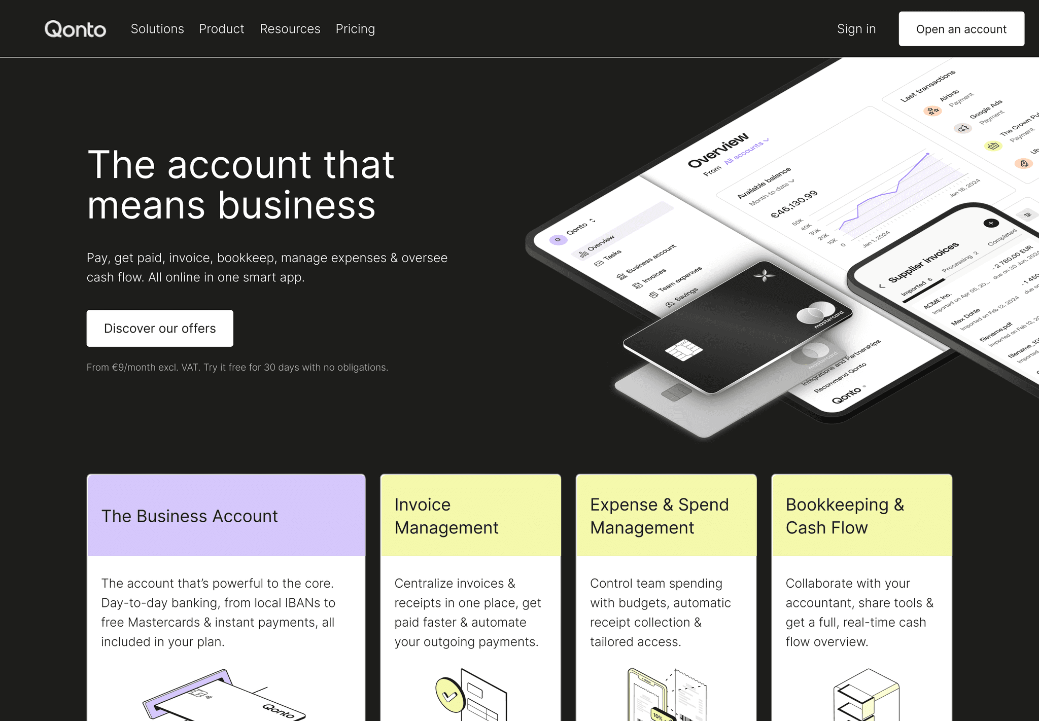
Professional and Trustworthy Qonto's landing page exudes professionalism and trust, crucial for a financial service. The use of calming colors, clear imagery, and well-structured content blocks effectively communicates reliability.
Key takeaways:
- Calming color palette
- Clear, professional imagery
- Well-structured content for easy comprehension
Supahub
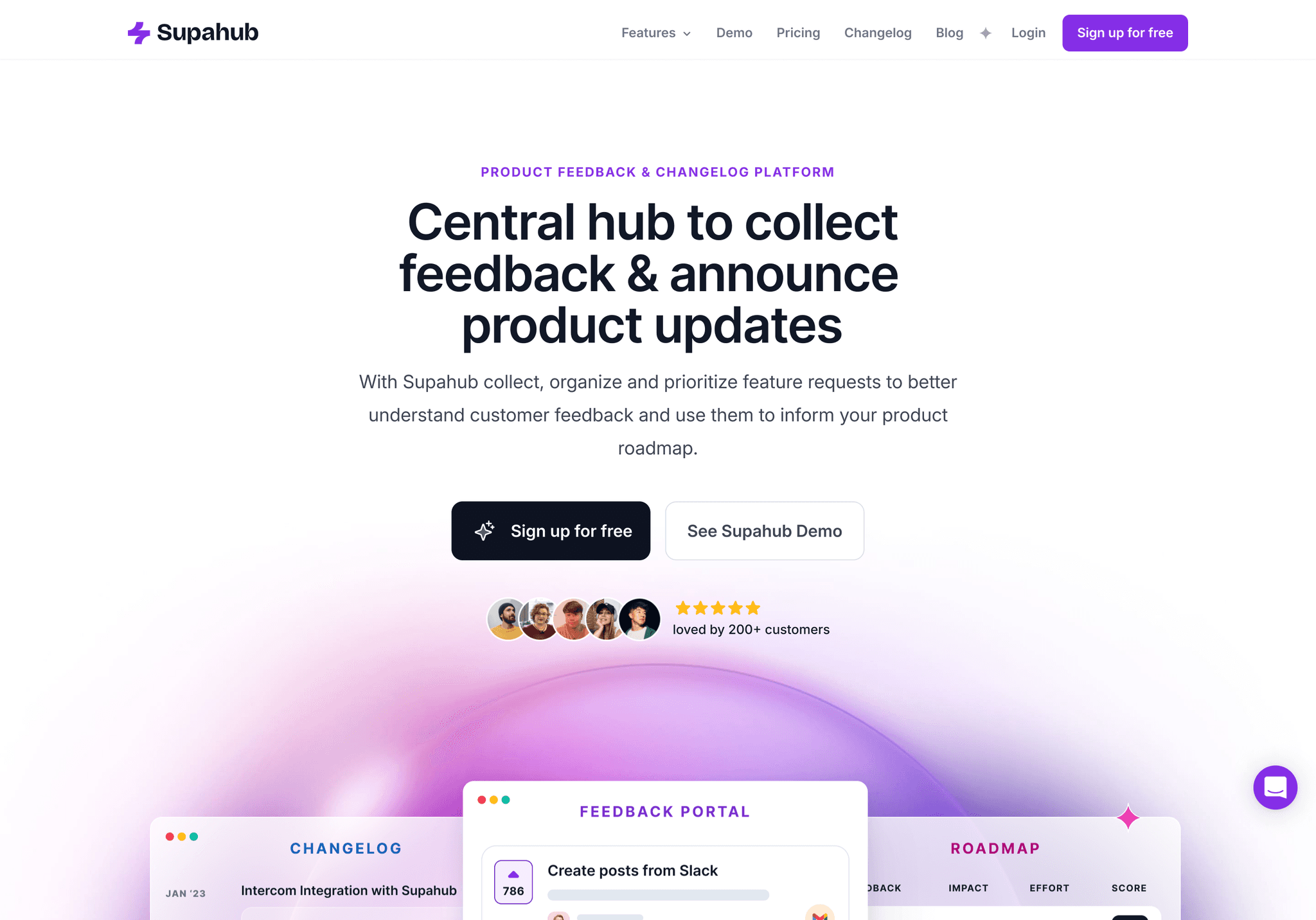
Modern and Engaging Supahub's landing page captivates with its modern design and engaging micro-interactions. The seamless blend of illustrations and UI elements creates a cohesive and inviting user experience.
Key takeaways:
- Modern design aesthetic
- Engaging micro-interactions
- Seamless blend of illustrations and UI elements
Wise
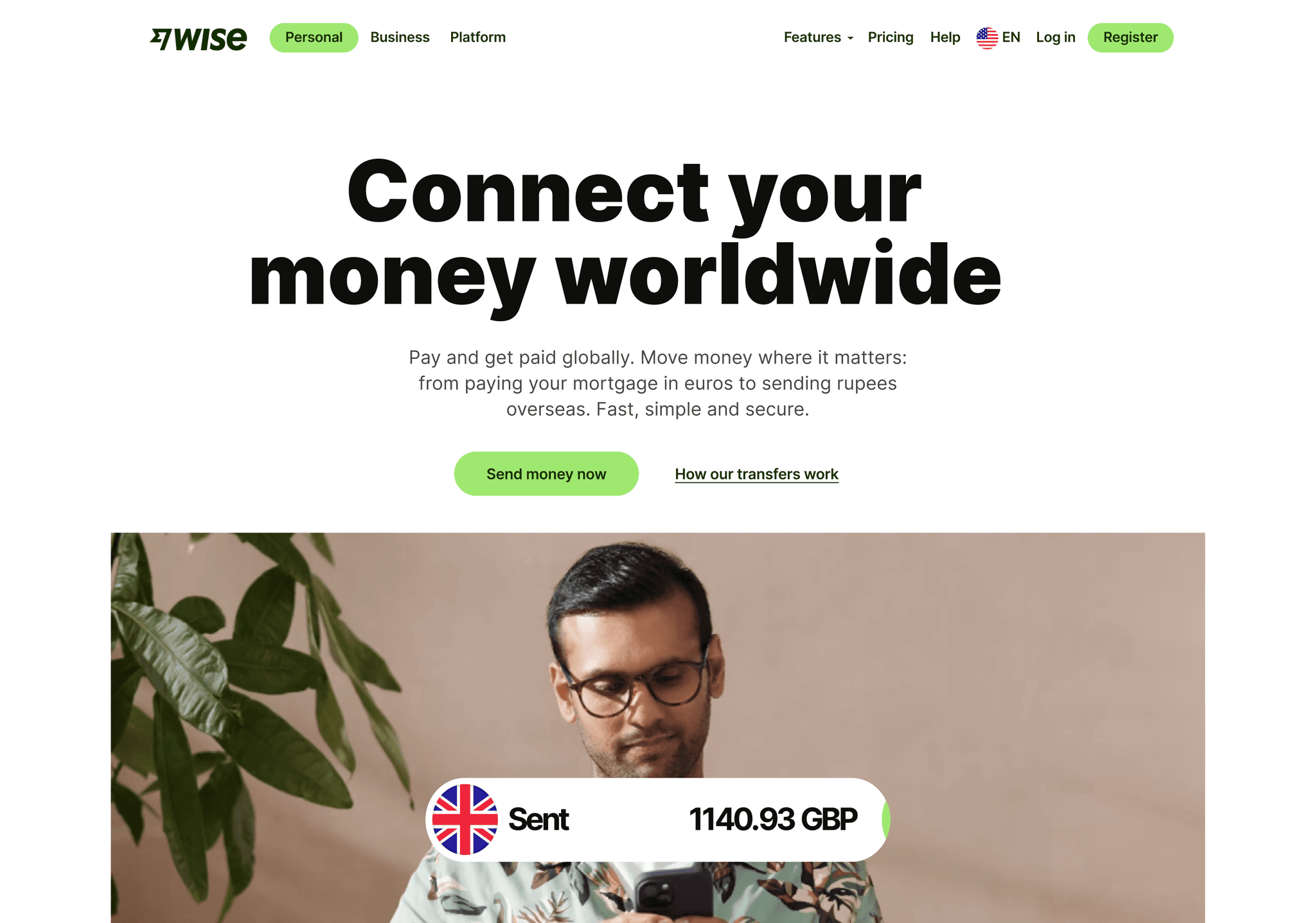
User-Centric and Clear Wise (formerly TransferWise) demonstrates a user-centric approach with its clear, benefit-focused design. The use of real currency data and comparison tools right on the landing page adds immediate value for visitors.
Key takeaways:
- User-centric design approach
- Clear focus on benefits
- Interactive tools for immediate value
Discord
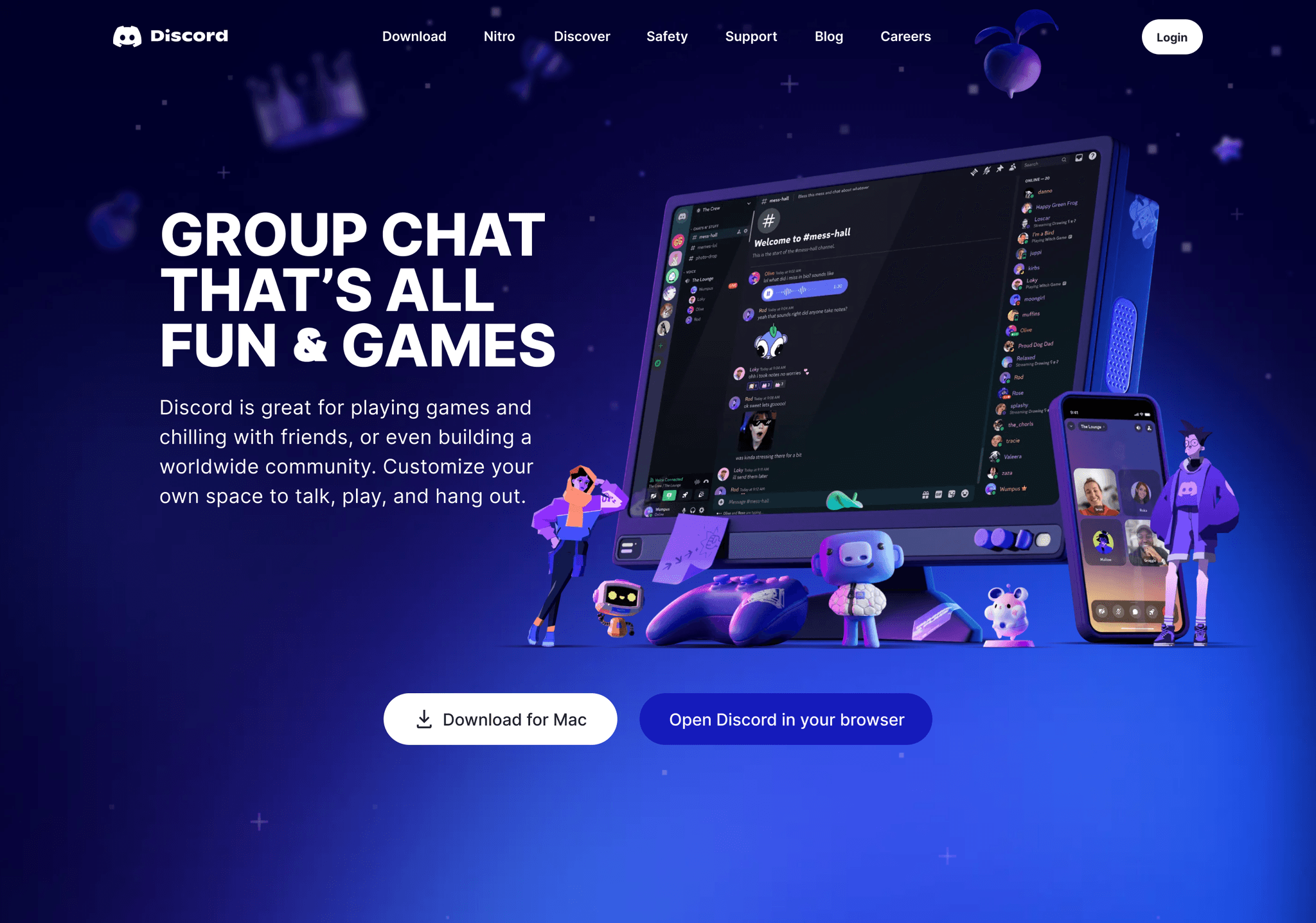
Community-Focused Design Discord's landing page reflects its community-centric platform with vibrant illustrations and a friendly tone. The design effectively balances information with visual appeal, creating an inviting atmosphere for potential users.
Key takeaways:
- Vibrant, community-focused illustrations
- Friendly and inviting tone
- Balanced information and visual appeal
Folk app
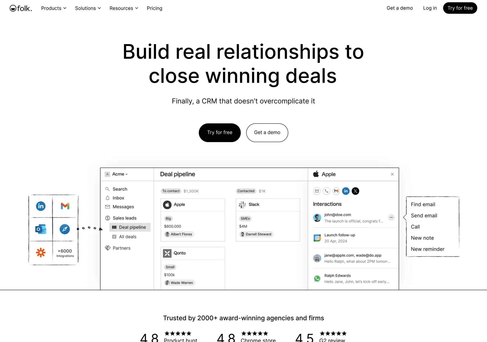
Elegant and Intuitive Folk App's landing page stands out with its elegant design and intuitive layout. The use of soft colors and smooth animations creates a pleasant browsing experience while effectively showcasing the app's features.
Key takeaways:
- Elegant, refined design
- Soft color palette
- Smooth animations for feature showcase
Scout
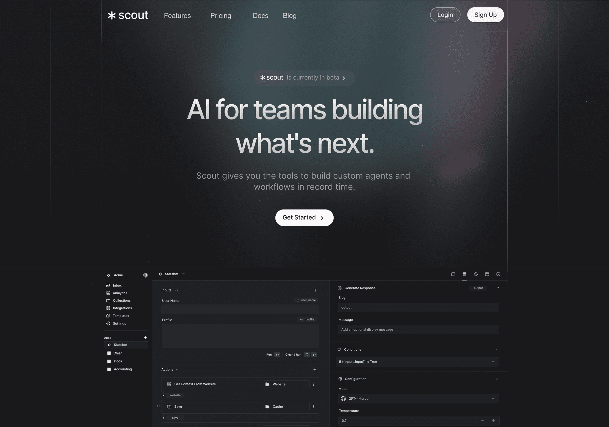
Adventure in Design Scout's landing page captures the spirit of adventure with its bold imagery and dynamic layout. The design effectively communicates the brand's outdoor focus while maintaining a clean, modern aesthetic.
Key takeaways:
- Bold, adventure-themed imagery
- Dynamic layout
- Clean, modern aesthetic
Jasper AI
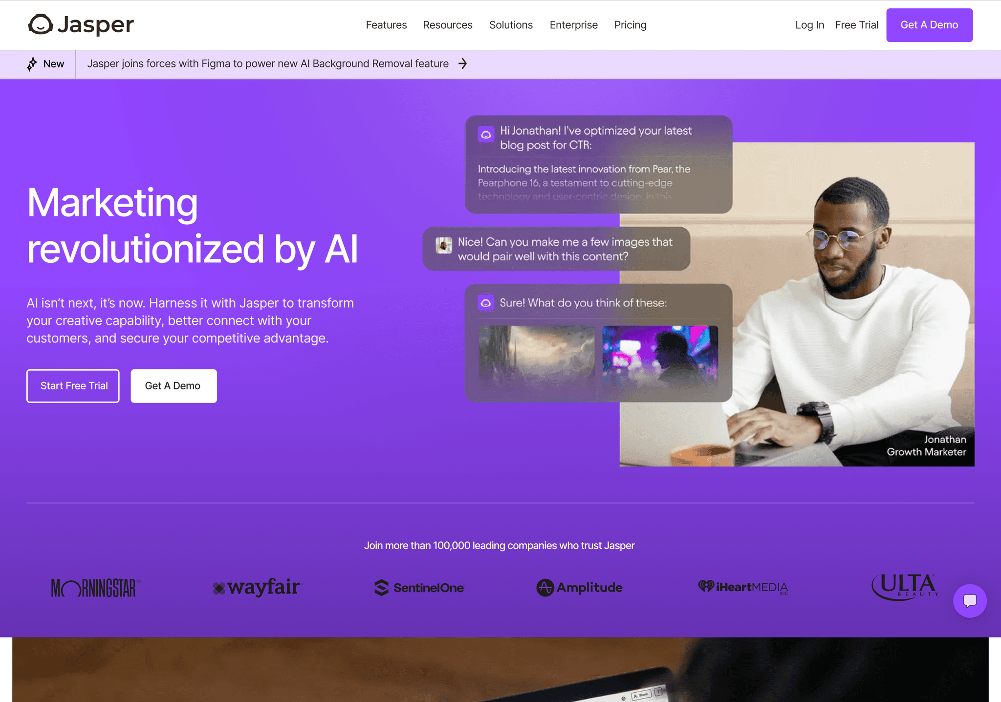
AI-Powered Creativity Jasper's landing page brilliantly showcases AI-powered creativity. The design incorporates futuristic elements and interactive demos, giving visitors a taste of the platform's capabilities right from the start.
Key takeaways:
- Futuristic design elements
- Interactive demos
- Clear showcase of AI capabilities
Lovi Care
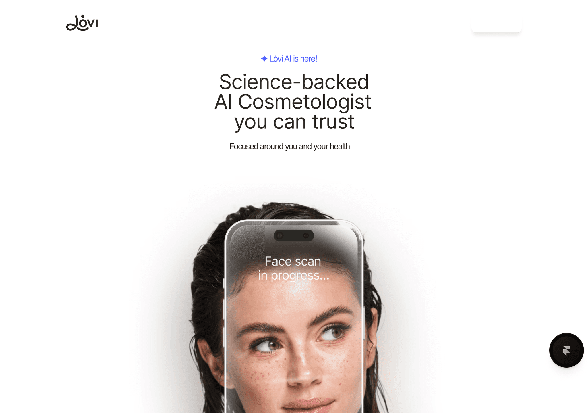
Playful and Innovative Lovi's landing page delights with its playful design and innovative scroll interactions. The use of 3D elements and animations creates a memorable and engaging user experience.
Key takeaways:
- Playful design elements
- Innovative scroll interactions
- Engaging 3D animations
Github
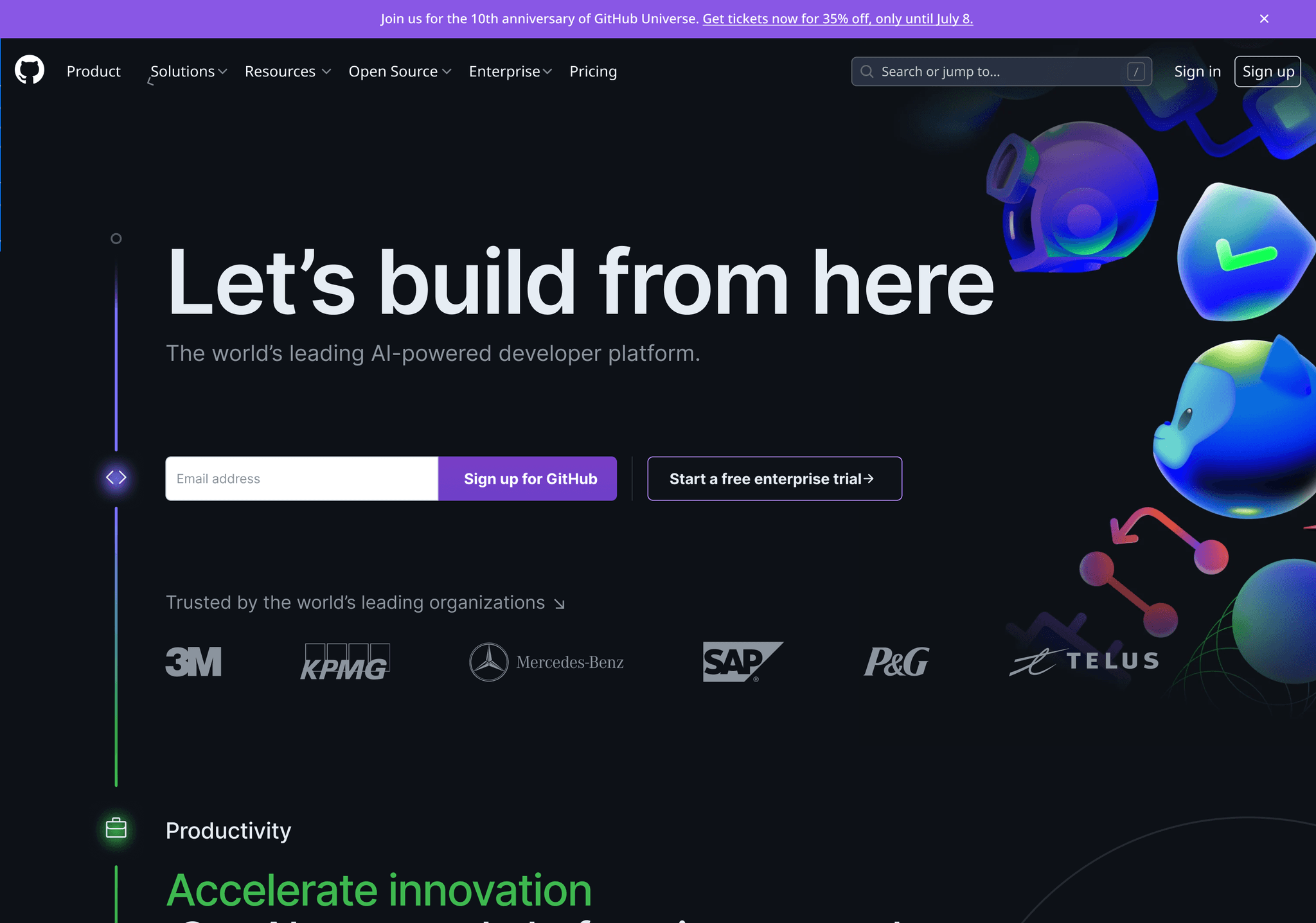
Developer-Friendly and Informative Github's landing page caters perfectly to its developer audience. The design balances technical information with clear calls-to-action, using code snippets and developer-centric imagery to create an inviting atmosphere.
Key takeaways:
- Developer-centric design
- Balanced technical information and CTAs
- Use of code snippets and relevant imagery
Kajabi
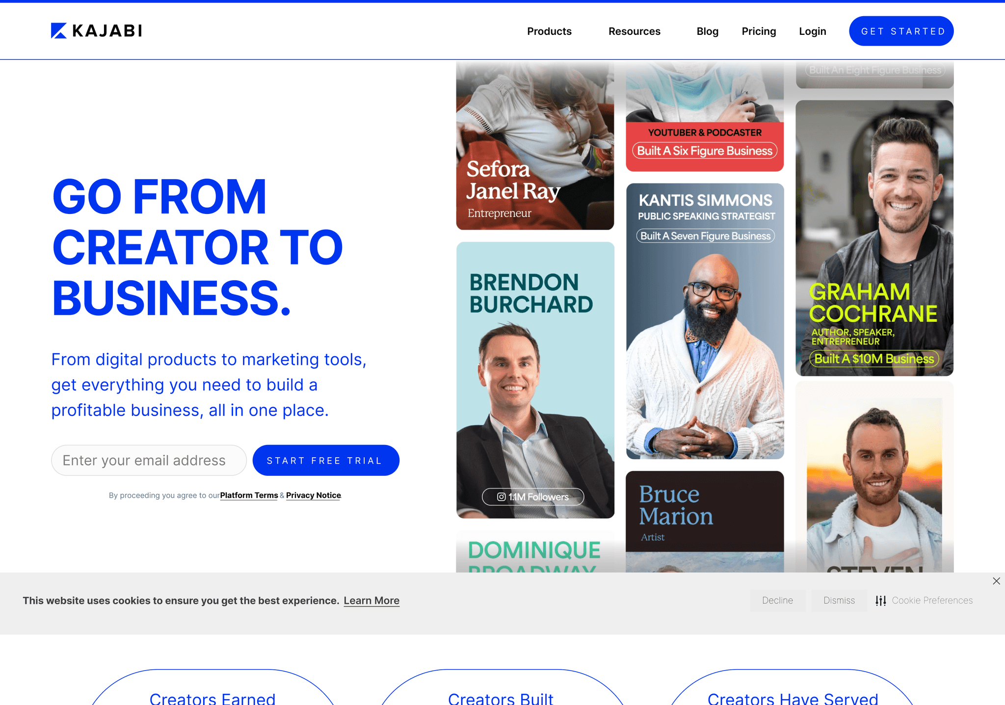
Empowering and Professional Kajabi's landing page design empowers creators with its professional and feature-rich layout. The use of social proof and benefit-focused sections effectively communicates the platform's value.
Key takeaways:
- Professional, feature-rich layout
- Effective use of social proof
- Clear communication of benefits
Supafast
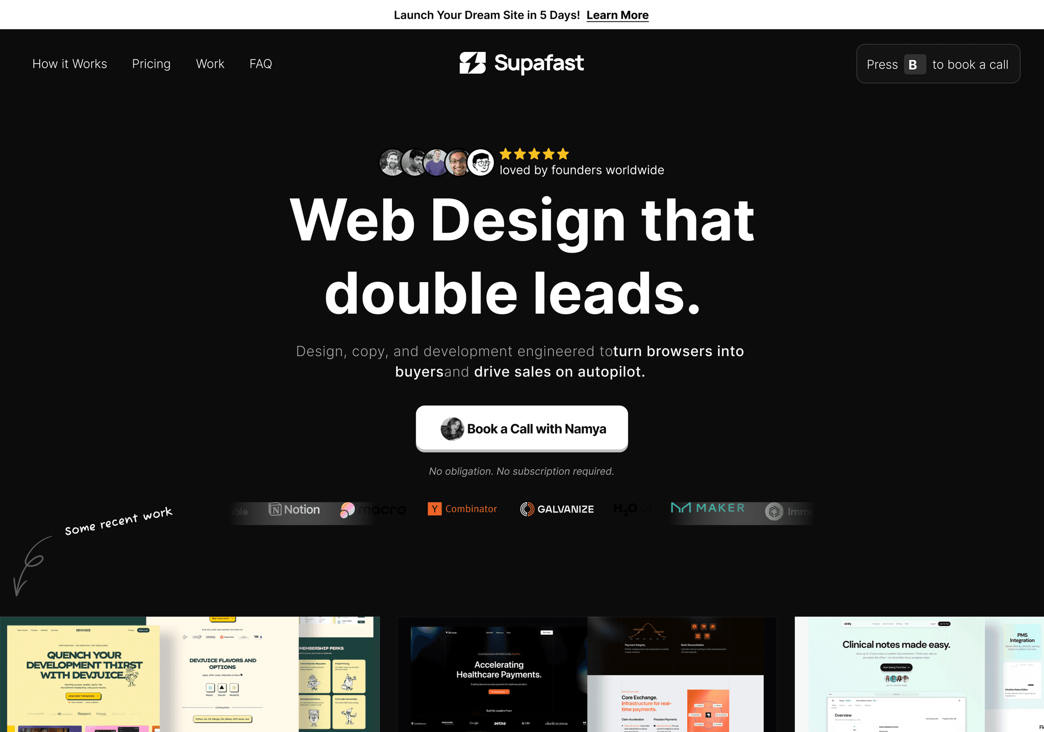
Speed and Simplicity Supafast's landing page embodies its name with a design focused on speed and simplicity. The minimalist layout with bold typography and strategic use of color highlights the platform's key benefits.
Key takeaways:
- Minimalist design approach
- Bold typography
- Strategic color use for highlighting benefits
Eraser
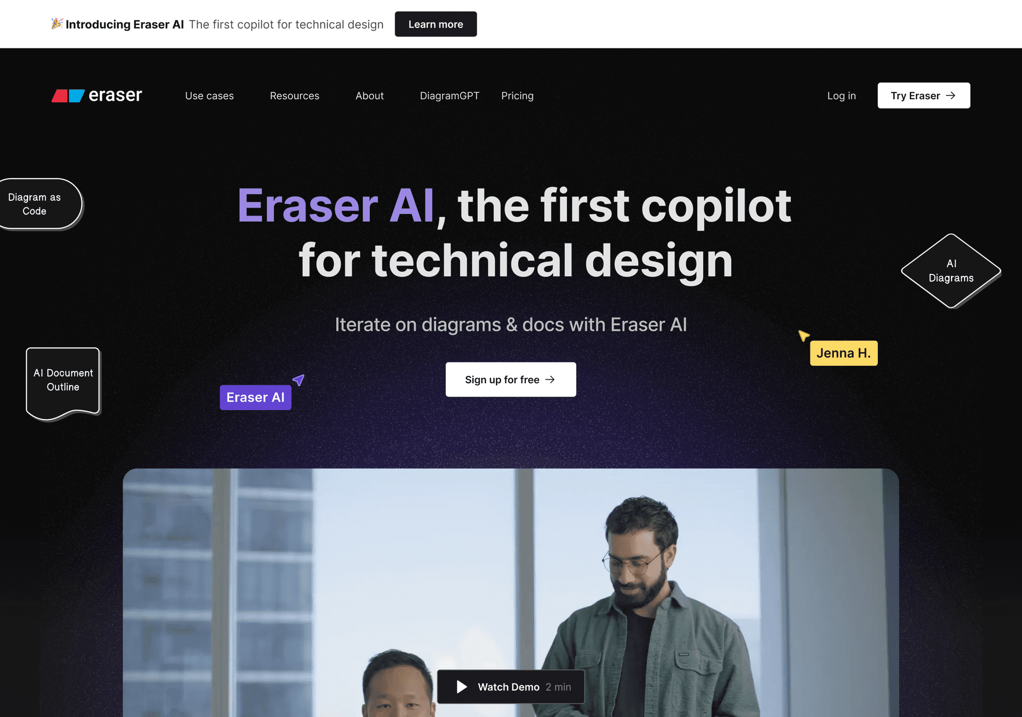
Clean and Collaborative Eraser's landing page showcases collaborative features through its clean and intuitive design. The use of whiteboard-style elements and interactive demos effectively communicates the tool's functionality.
Key takeaways:
- Clean, intuitive design
- Whiteboard-style design elements
- Interactive demos for feature showcase
Current Vehicles
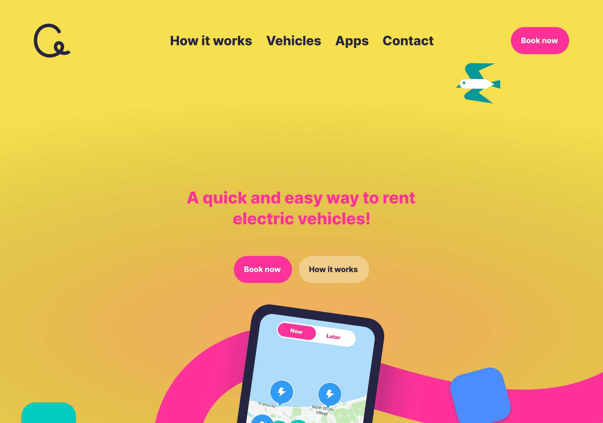
Sleek and Futuristic Current Vehicles presents a sleek, futuristic landing page that aligns perfectly with its electric vehicle offerings. The design uses high-quality imagery and smooth animations to create an immersive experience.
Key takeaways:
- Organic design elements
- Community-focused approach
- Warm color palette
Beehiiv
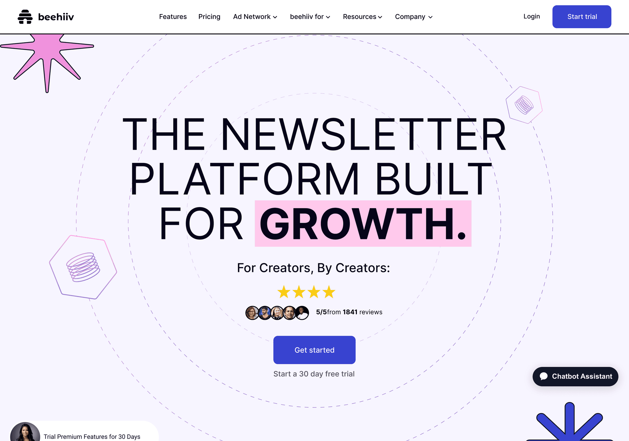
Organic and Community-Driven Beehiiv's landing page stands out with its organic design elements and community-focused approach. The use of honeycomb patterns and warm colors creates a welcoming atmosphere for content creators.
Key takeaways:
- Organic design elements
- Community-focused approach
- Warm color palette
Loom
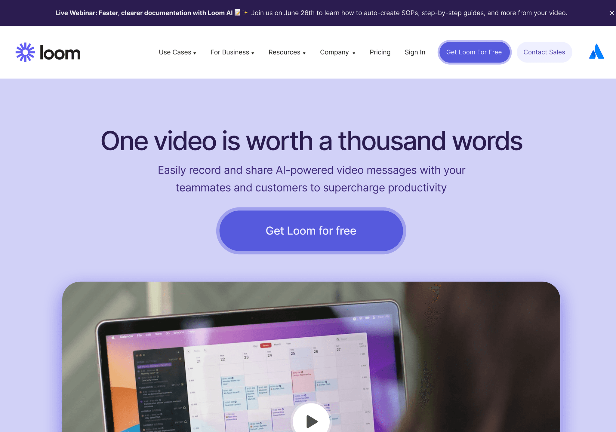
Video-Centric and Dynamic Loom's landing page puts video content at the forefront, reflecting its core product. The design incorporates video thumbnails and playful animations to create an engaging and interactive experience.
Key takeaways:
- Video-centric design
- Playful animations
- Interactive elements
Pera Wallet
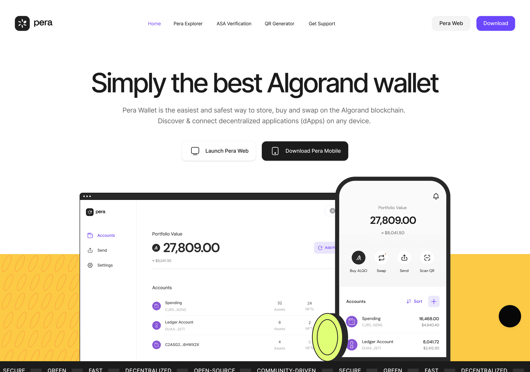
Secure and User-Friendly Pera Wallet's landing page balances security with user-friendliness. The design uses blockchain-inspired graphics and clear feature explanations to build trust and educate users.
Key takeaways:
- Balance of security and user-friendliness
- Blockchain-inspired graphics
- Clear feature explanations
Flow
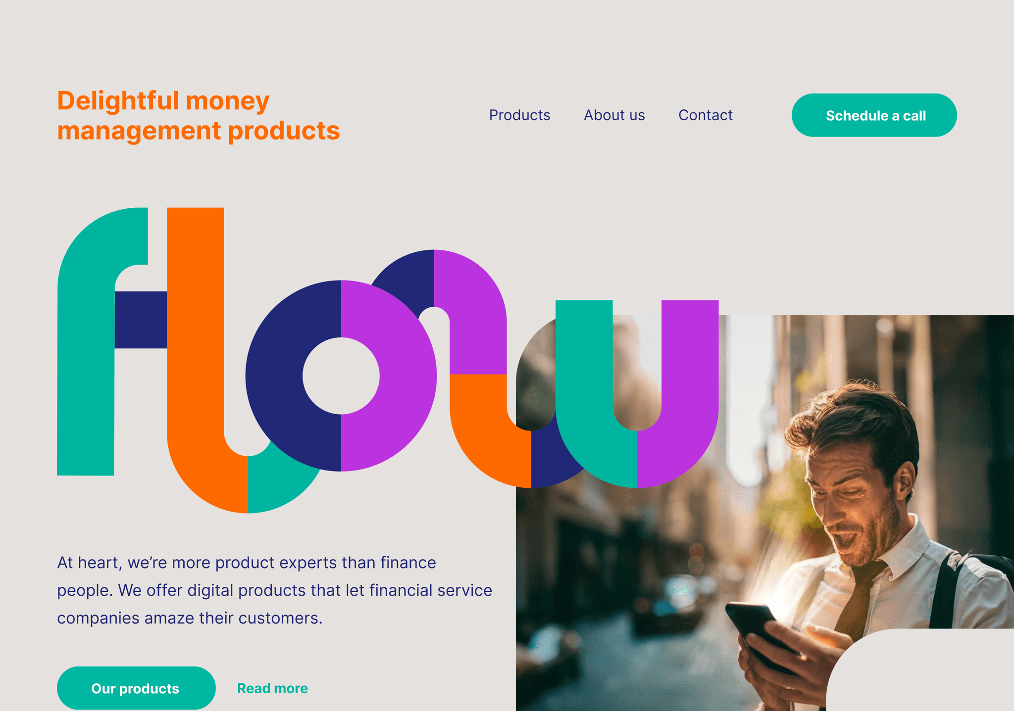
Fluid and Innovative Flow's landing page lives up to its name with a fluid, innovative design. The use of gradient backgrounds and flowing animations creates a sense of movement and progress.
Key takeaways:
- Fluid design elements
- Innovative use of gradients
- Animations conveying movement
Graphy
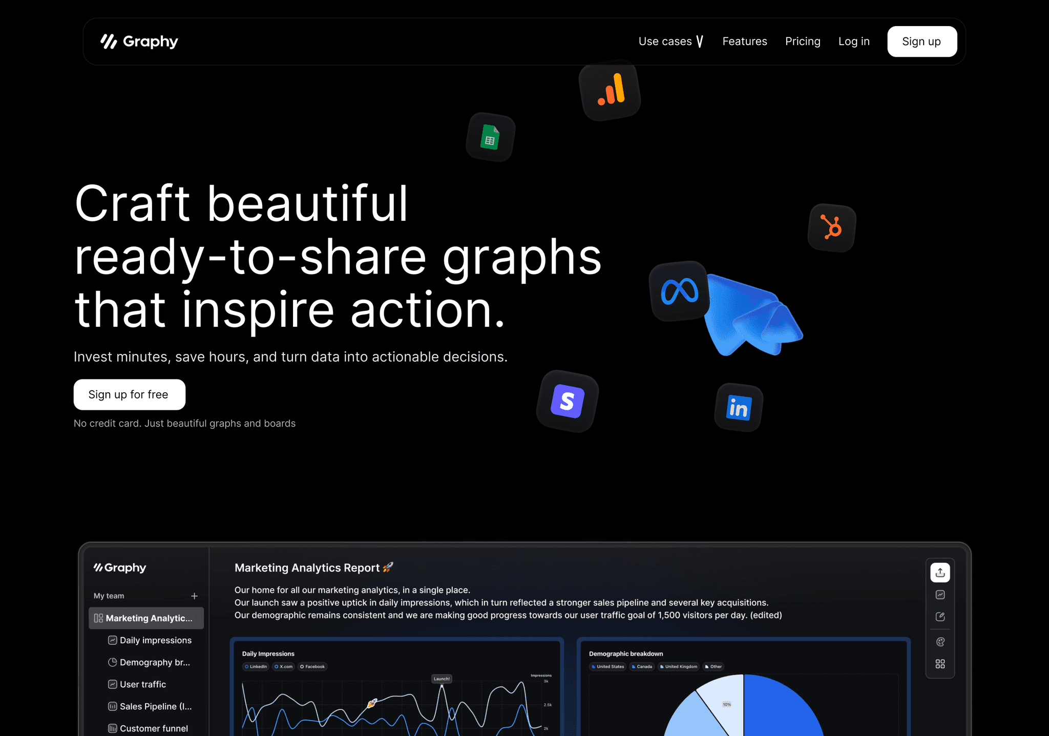
Data-Driven and Clear Graphy app's landing page excels in presenting complex data in a clear, visually appealing manner. The design incorporates graph elements and data visualizations to showcase the app's capabilities.
Key takeaways:
- Clear presentation of complex data
- Effective use of data visualizations
- Visual elements reflecting app functionality
Polymer
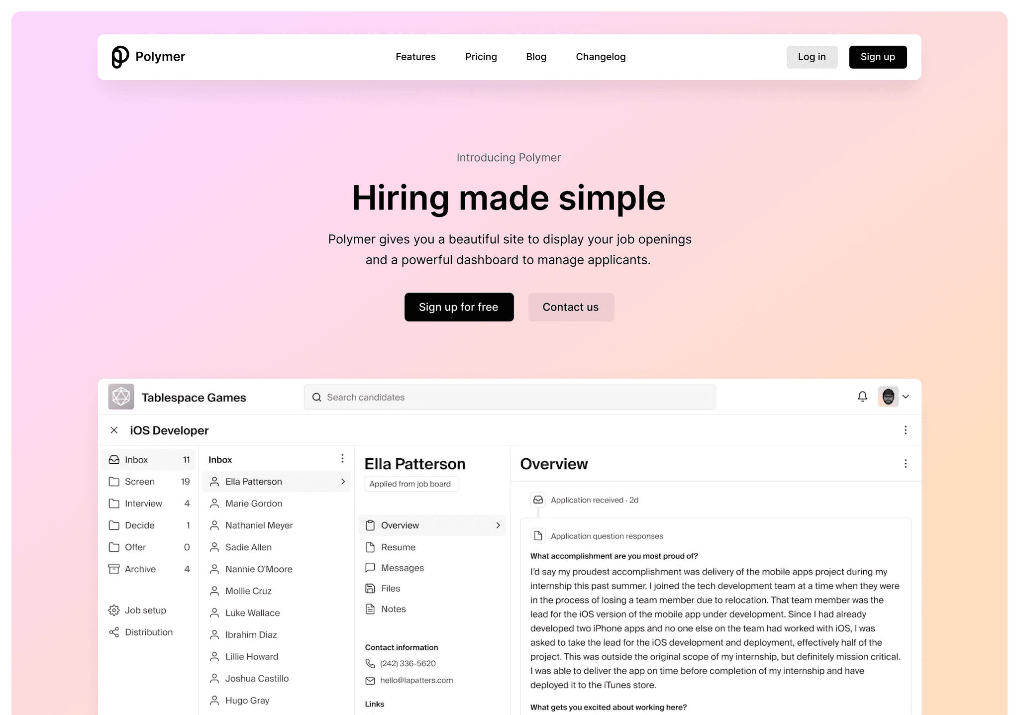
Modular and Flexible Polymer's landing page reflects its modular approach with a flexible, component-based design. The layout effectively demonstrates the platform's adaptability and ease of use.
Key takeaways:
- Modular, component-based design
- Flexible layout
- Clear demonstration of adaptability
Wealth Simple
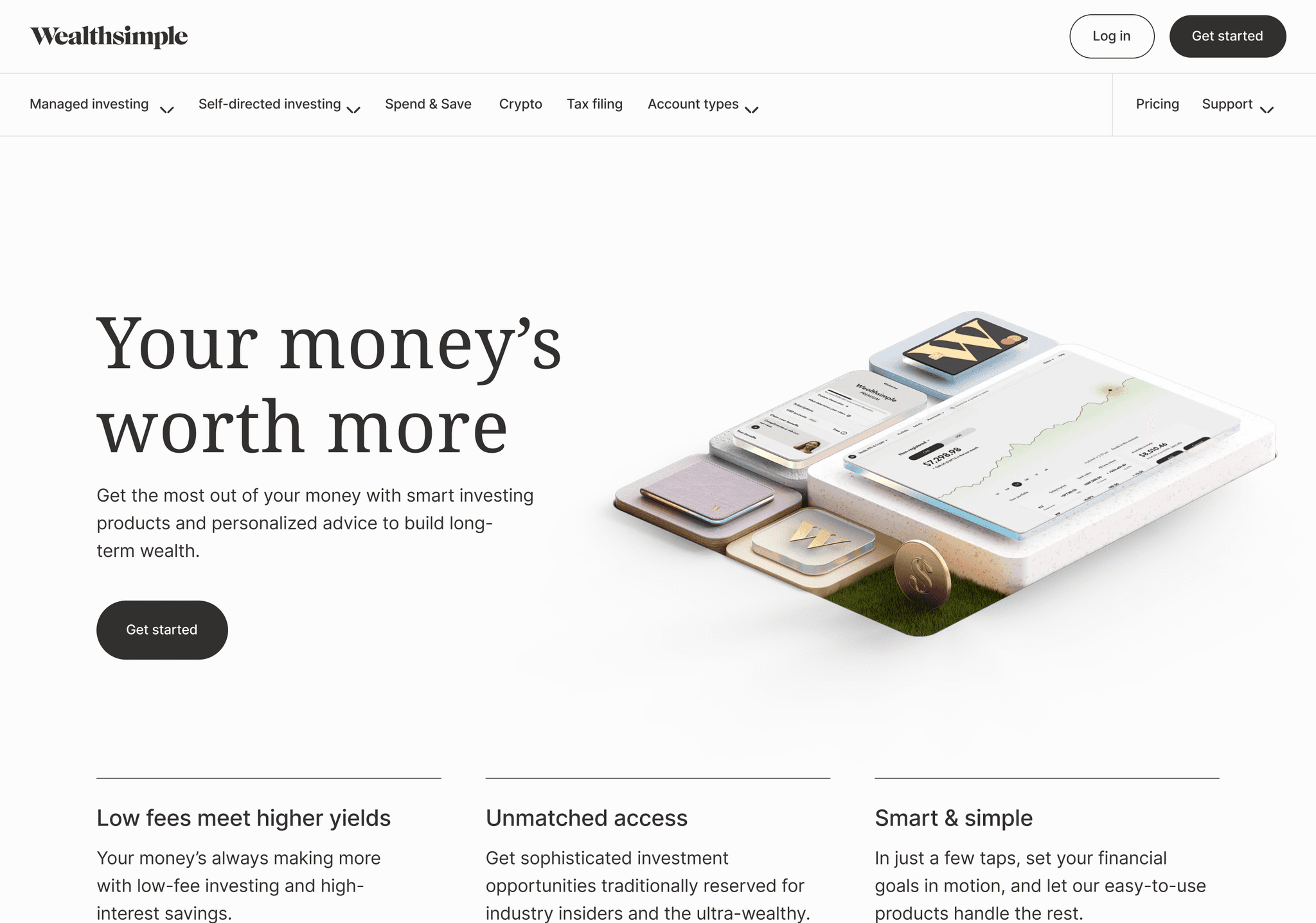
Approachable and trustworthy Wealth Simple's landing page makes finance approachable with its clean design and friendly imagery. The use of calming colors and clear information hierarchy builds trust and encourages engagement.
Key takeaways:
- Approachable design for financial services
- Use of friendly imagery
- Clear information hierarchy
Parthean
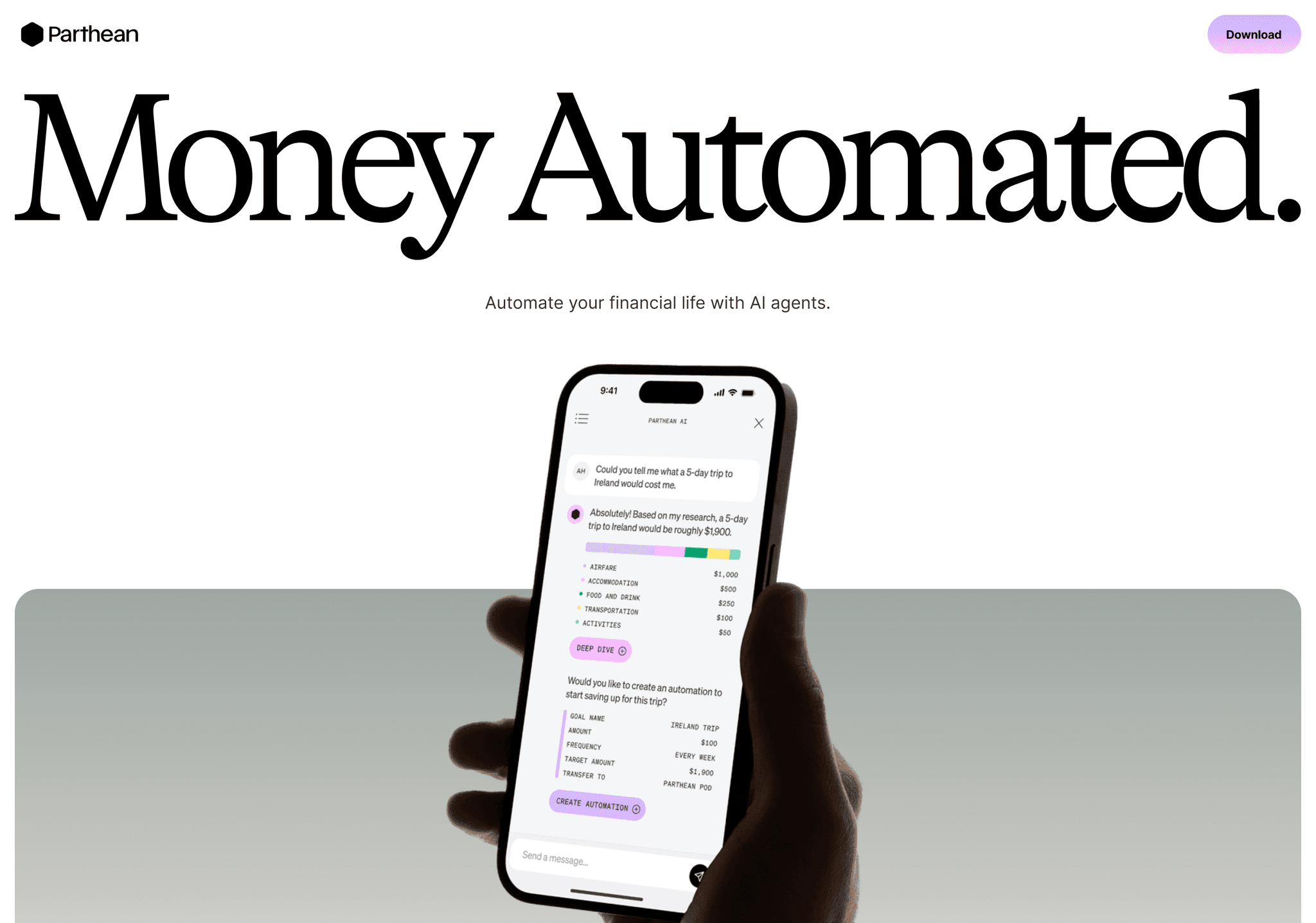
Intelligent and Sleek Parthean AI's landing page showcases artificial intelligence with a sleek, futuristic design. The use of abstract AI-inspired graphics and interactive elements creates an immersive experience.
Key takeaways:
- Sleek, futuristic design
- AI-inspired graphic elements
- Interactive features for immersion
Config
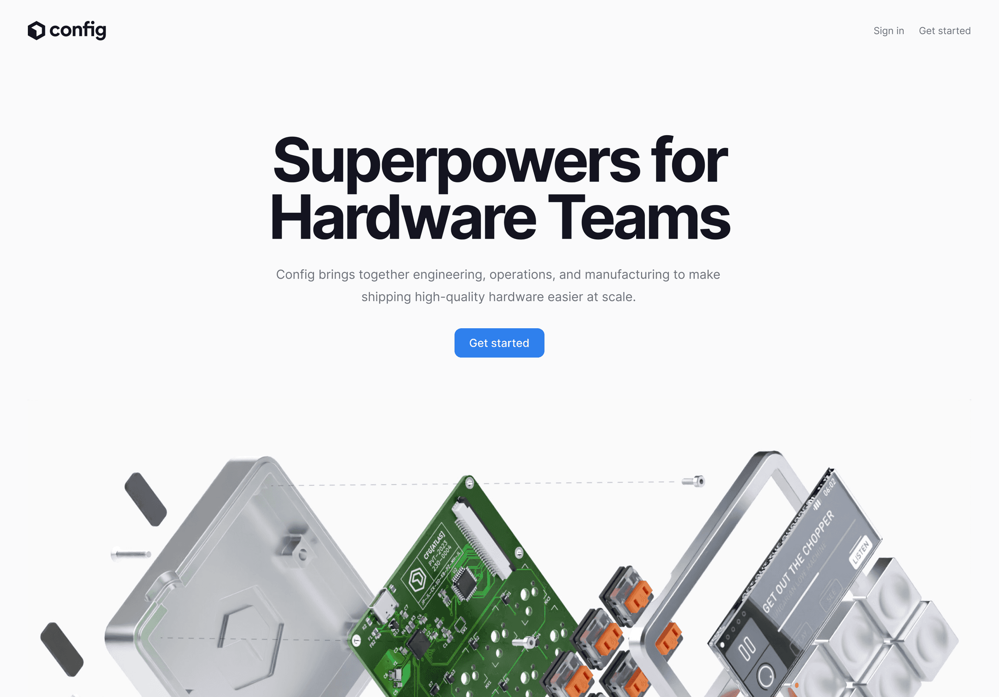
Customizable and Powerful Config's landing page highlights customization with its adaptable design elements. The layout effectively demonstrates the platform's flexibility while maintaining a cohesive look.
Key takeaways:
- Emphasis on customization
- Adaptable design elements
- Cohesive overall aesthetic
Kosmik
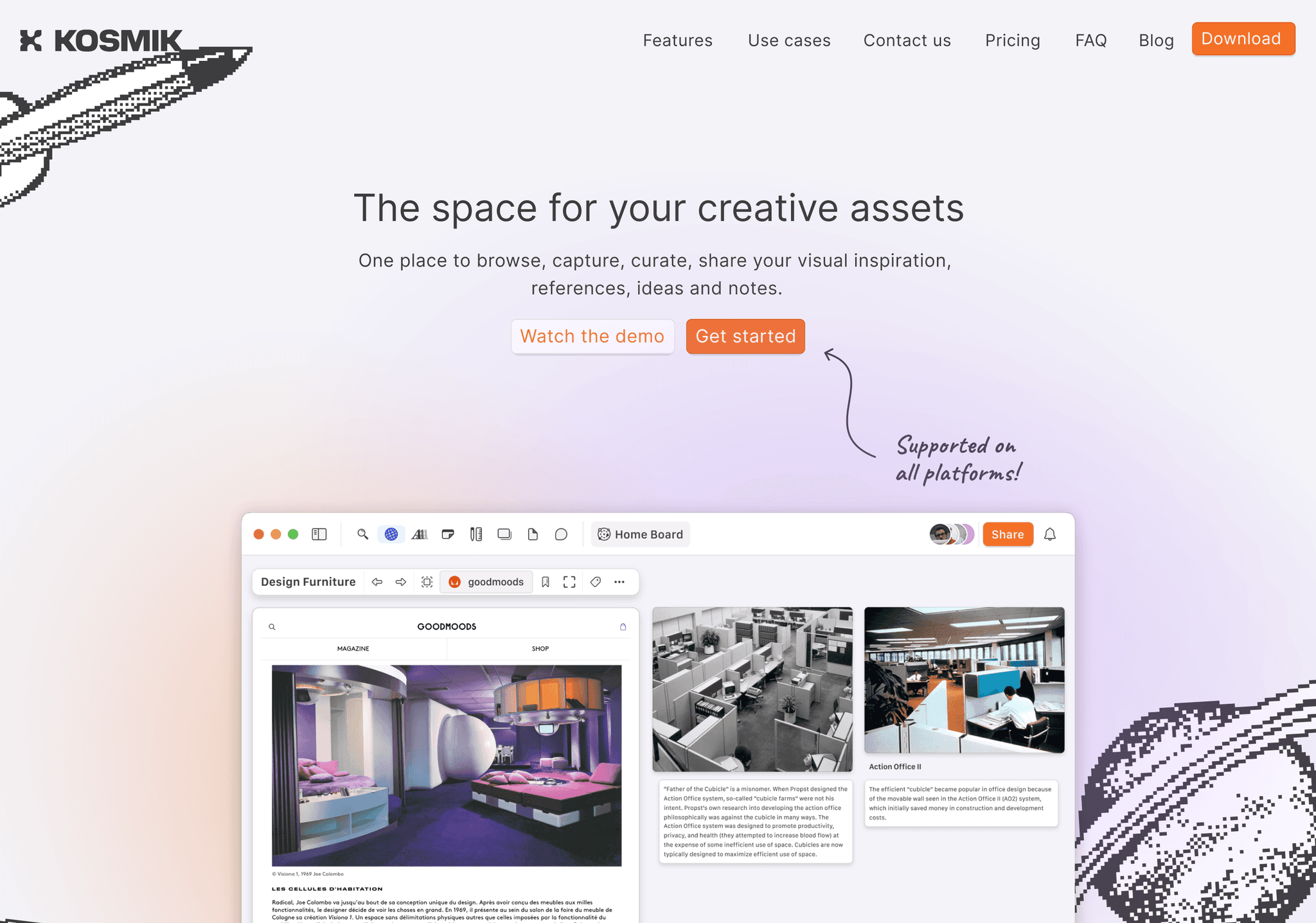
Cosmic and Creative Kosmik's landing page takes users on a cosmic journey with its creative design. The use of space-themed elements and dynamic animations creates a unique and memorable user experience
Key takeaways:
- Cosmic-themed design elements
- Creative use of animations
- Unique and memorable user experience
Want to explore these inspiring landing pages in detail? We've got you covered. Access our comprehensive Figma file containing editable versions of all 30 landing page design examples mentioned above. This valuable resource allows you to dissect, analyze, and learn from these top-notch designs directly within Figma. Get your hands on this treasure trove of design inspiration here:
Key Trends in Landing Page Design for 2024
As we reflect on these 30 outstanding examples, several trends and best practices emerge:
- Minimalism with a Twist: Clean designs are still prevalent, but with unique elements that add character and brand identity. Designers are finding creative ways to stand out while maintaining simplicity.
- Bold Typography: Many landing pages use typography as a central design element, creating visual interest and improving readability. Oversized fonts, unique typefaces, and creative text layouts are becoming more common.
- Micro-interactions: Subtle animations and interactive elements enhance user engagement without overwhelming the core message. These small details can significantly improve the overall user experience.
- Dark Mode Dominance: Dark-themed designs continue to gain popularity, offering a sleek and modern aesthetic. They're not just visually appealing but also easier on the eyes, especially for users who spend a lot of time on screens.
- Illustration Integration: Custom illustrations help brands stand out and communicate complex ideas simply. They add personality to the design and can make technical concepts more approachable.
- Gradient Resurgence: Gradients are back in a big way, adding depth and visual interest to backgrounds and UI elements. They're being used in more subtle and sophisticated ways compared to previous trends.
- Video Content: More landing pages are incorporating video content to quickly communicate value propositions. From background videos to product demos, moving images are capturing users' attention effectively.
- Data Visualization: Presenting data in visually appealing ways helps users quickly grasp key information. Infographics, charts, and interactive data displays are becoming more prevalent.
- Mobile-First Approach: Designs are increasingly optimized for mobile experiences, with seamless responsiveness across devices. This trend reflects the growing dominance of mobile browsing.
- Accessibility Focus: There's a growing emphasis on creating designs that are accessible to all users, regardless of abilities. This includes considerations for color contrast, font sizes, and navigational ease.
- Asymmetrical Layouts: Breaking away from traditional grid-based designs, many landing pages are embracing asymmetry to create visual interest and guide user attention.
- Scrollytelling: Some landing pages are using scroll-based animations to tell a story as users navigate down the page, creating an engaging narrative experience.
- Brutalism Influence: While not mainstream, some designs are incorporating elements of brutalism, with raw, exposed structures and unconventional layouts.
- Glassmorphism: This design trend, characterized by frosted glass-like elements, is adding depth and sophistication to user interfaces.
- Personalization: More landing pages are incorporating elements that adapt to user preferences or behaviors, creating a more tailored experience.
Analyzing Landing Page Elements
To create an effective landing page, it's crucial to understand the key elements that contribute to its success. Let's break down the essential components:
- Hero Section: This is typically the first thing visitors see. It should clearly communicate your value proposition and include a strong call-to-action (CTA).
- Navigation: Keep it simple and intuitive. For single-page landing pages, consider using anchor links to different sections.
- Value Proposition: Clearly state what makes your product or service unique and valuable to your target audience.
- Features and Benefits: Highlight the key features of your offering and, more importantly, how they benefit the user.
- Social Proof: Include testimonials, client logos, or user statistics to build trust and credibility.
- Call-to-Action (CTA): Use clear, action-oriented language for your CTAs. Make them stand out visually and place them strategically throughout the page.
- Visual Elements: Use high-quality images, videos, or animations that support your message and enhance the overall design.
- Whitespace: Effective use of whitespace (or negative space) can improve readability and guide the user's attention to important elements.
- Typography: Choose fonts that are readable and align with your brand. Use hierarchy to guide users through your content.
- Color Scheme: Select colors that reflect your brand and create the right emotional response. Use contrast to highlight important elements.
- Mobile Responsiveness: Ensure your landing page looks and functions well on all device sizes.
- Loading Speed: Optimize images and code to ensure fast loading times, which is crucial for user experience and SEO.
- Footer: Include essential links, contact information, and possibly a secondary CTA.
Conclusion
As we've seen from these 30 inspiring examples and the wealth of best practices, the art of landing page design continues to evolve. The key to creating an effective landing page lies in understanding your audience, clearly communicating your value proposition, and crafting a visually appealing and user-friendly experience.
Remember, great design is iterative. Use tools like the Web To Figma plugin to study and learn from these examples, but don't be afraid to experiment and find your unique style. Your perfect landing page is out there, waiting to be designed.
Here are some final thoughts to keep in mind as you embark on your landing page design journey:
- Know Your Audience: Tailor your design and messaging to your specific target audience. What works for a tech startup might not work for a financial services company.
- Focus on Benefits: While features are important, users are more interested in how your product or service will benefit them. Make this clear in your copy and design.
- Keep it Simple: Don't overwhelm your visitors with too much information. Focus on the most important messages and make your call-to-action clear.
- Test and Iterate: Use analytics and A/B testing to continuously improve your landing page. Small changes can often lead to significant improvements in conversion rates.
- Stay Updated: Keep an eye on emerging design trends and user experience best practices. The digital landscape is always evolving.
- Maintain Brand Consistency: While it's great to take inspiration from others, ensure your landing page aligns with your overall brand identity.
- Prioritize User Experience: Always put yourself in the shoes of your users. Is the page easy to navigate? Is the information clear? Is the next step obvious?
Whether you're working on a startup's first impression, a product launch, or a portfolio showcase, let these inspirations guide you. And with Web To Figma at your disposal, you have the power to dissect, analyze, and reimagine any web design that catches your eye.
Remember, the most effective landing pages are those that not only look great but also achieve their intended purpose. By combining aesthetic appeal with strategic design and clear messaging, you can create landing pages that not only attract visitors but convert them into customers or clients.
As you move forward with your landing page design projects, stay curious, keep experimenting, and most importantly, never stop learning. The world of web design is vast and ever-changing, offering endless opportunities for creativity and innovation.
Here's to pushing the boundaries of landing page design in 2024 and beyond and don’t forget to get Web To Figma as your companion in your design journey!